Uniwersytet Warszawski: Wydział Neofilologii
The project has received a Gold Medal
in the international competition
Indigo Design Awards 2024!
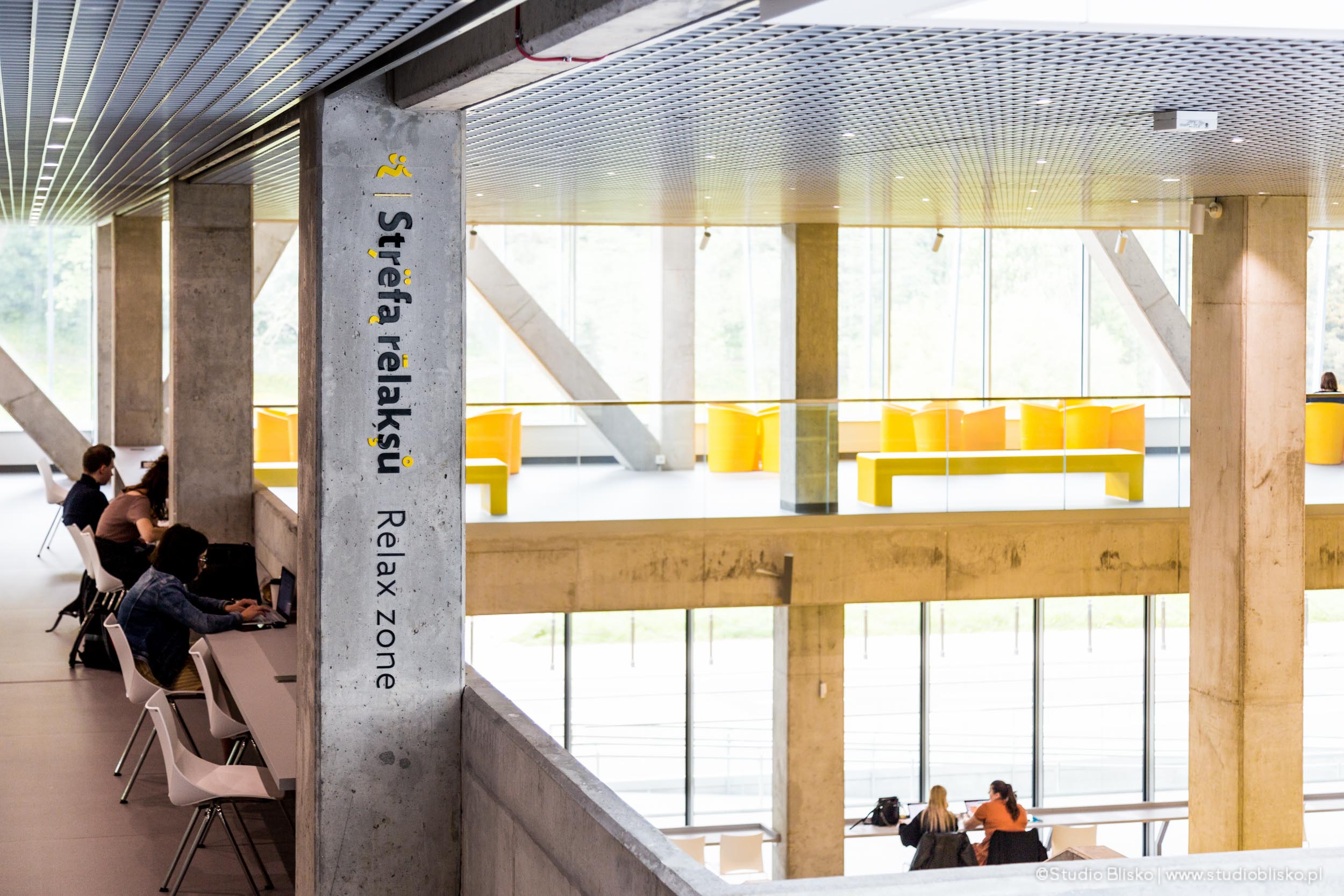
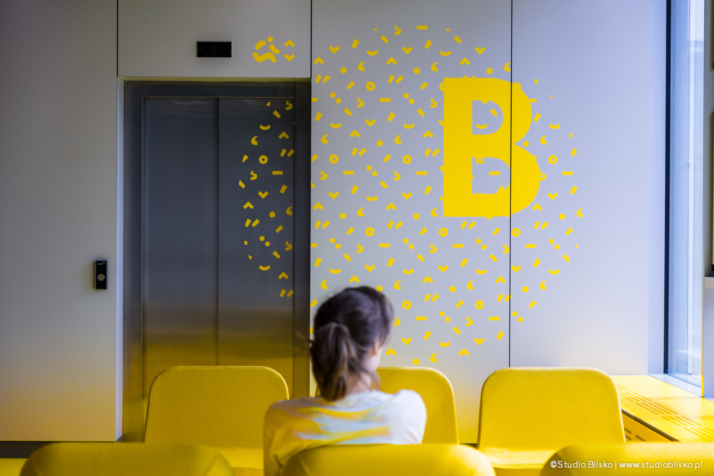
Wayfinding for the student space can be less formal and has phenomenal potential for being engaging and intriguing, adequately meeting the target audience’s perception – students, hungry for knowledge and contacts of peers, in a space fermenting from the exchange of knowledge, experiences, and emotions. I adopted this looser convention in the signage project. Therefore, it is not only utilitarian and functional, strictly informative but also a distinct aesthetic value added to the corridors’ space. It is the result of playing with form and winking at the viewer between the lines.
We started considering the wayfinding system for this project by analyzing its functions and context. According to the Investor’s guidelines, the building was intended for the use of the Faculty of Neophilology at the University of Warsaw. Therefore, the functional program of the building takes into account the needs of educational, administrative, and scientific functions. The building is also expected to accommodate a cross-faculty unit: the Center for Communication Science. This functional context dictated the formal solutions for wayfinding, as well as the tone of the visual narration.
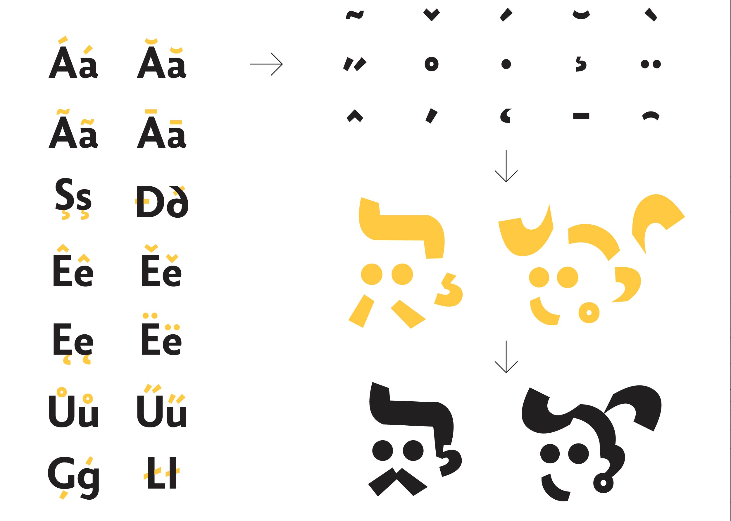
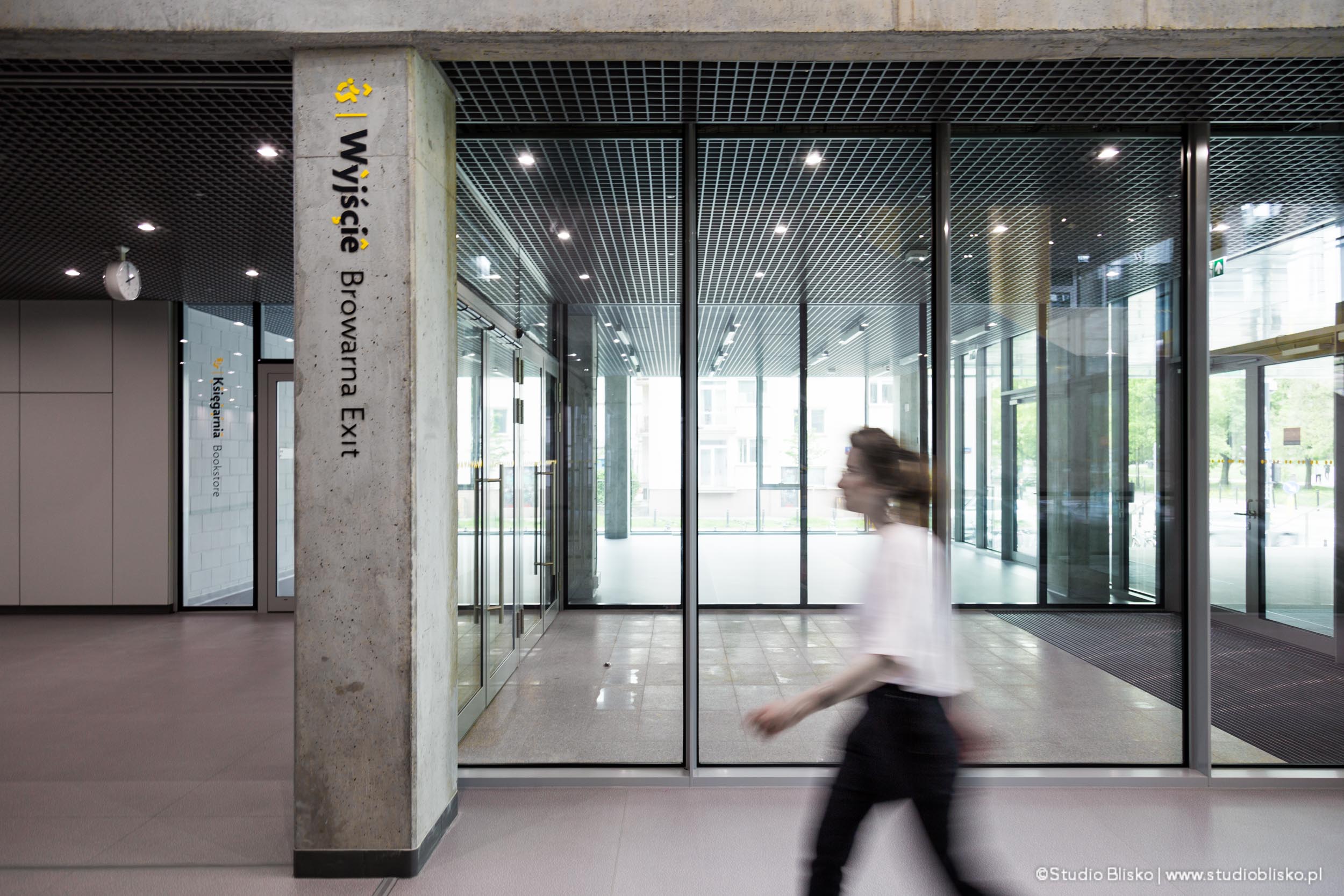
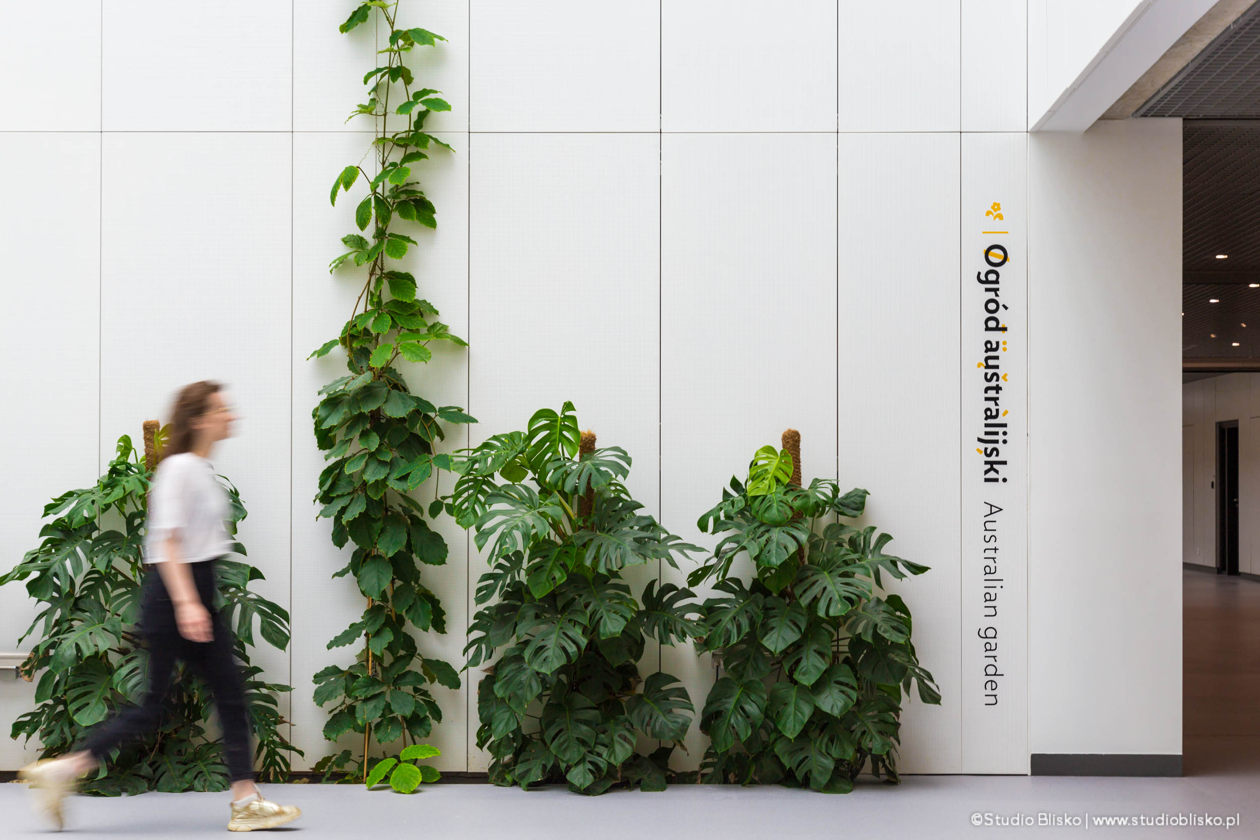
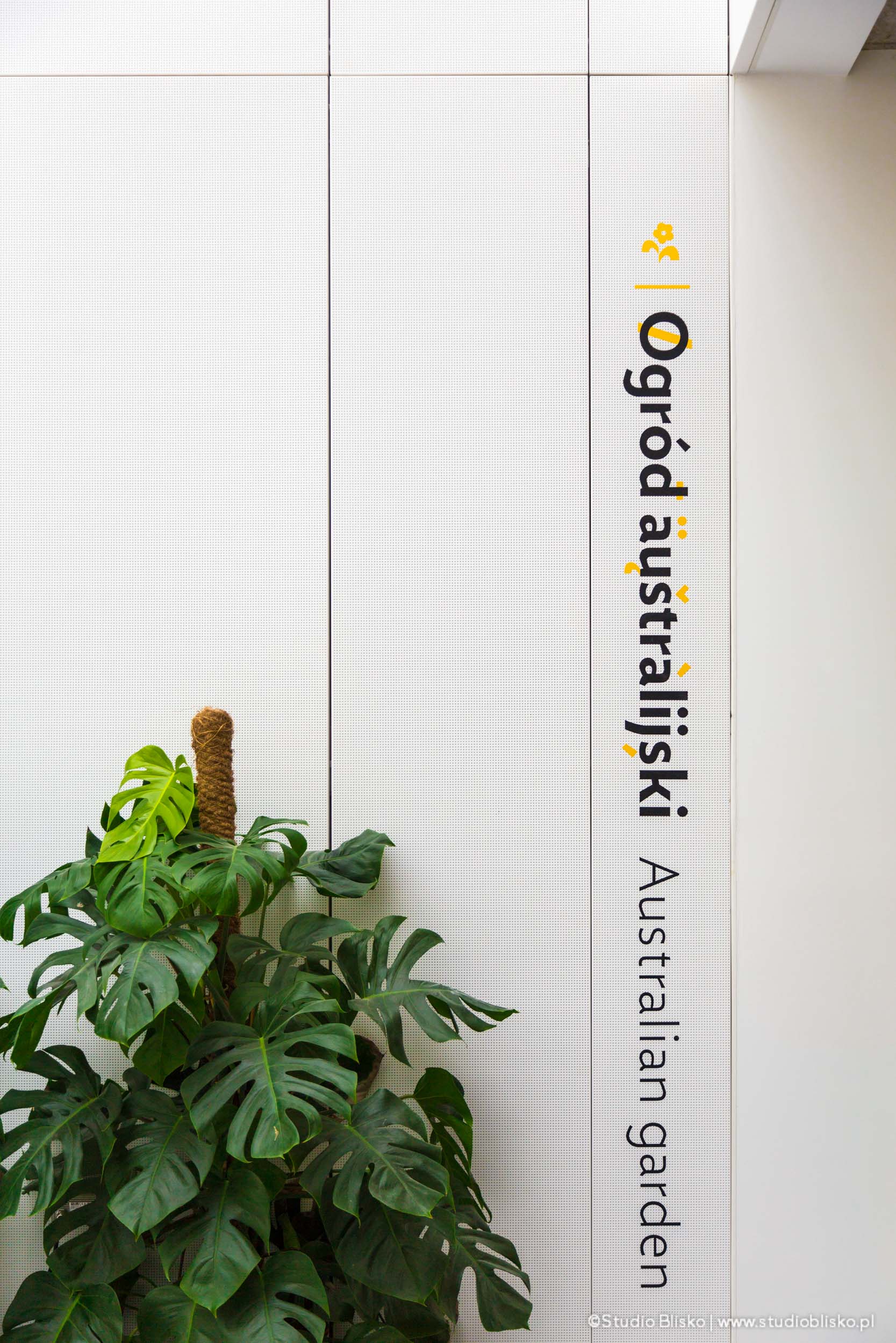
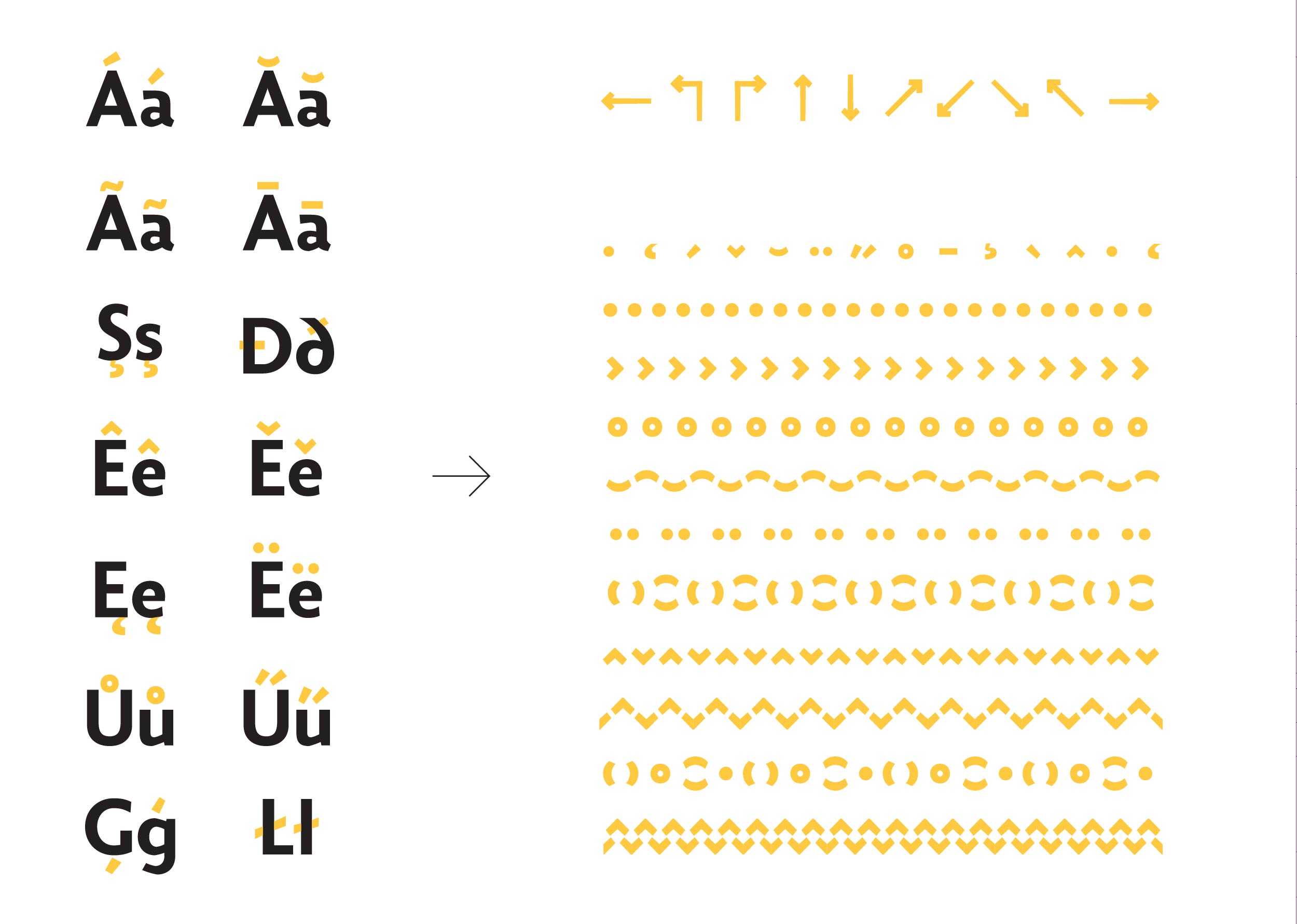
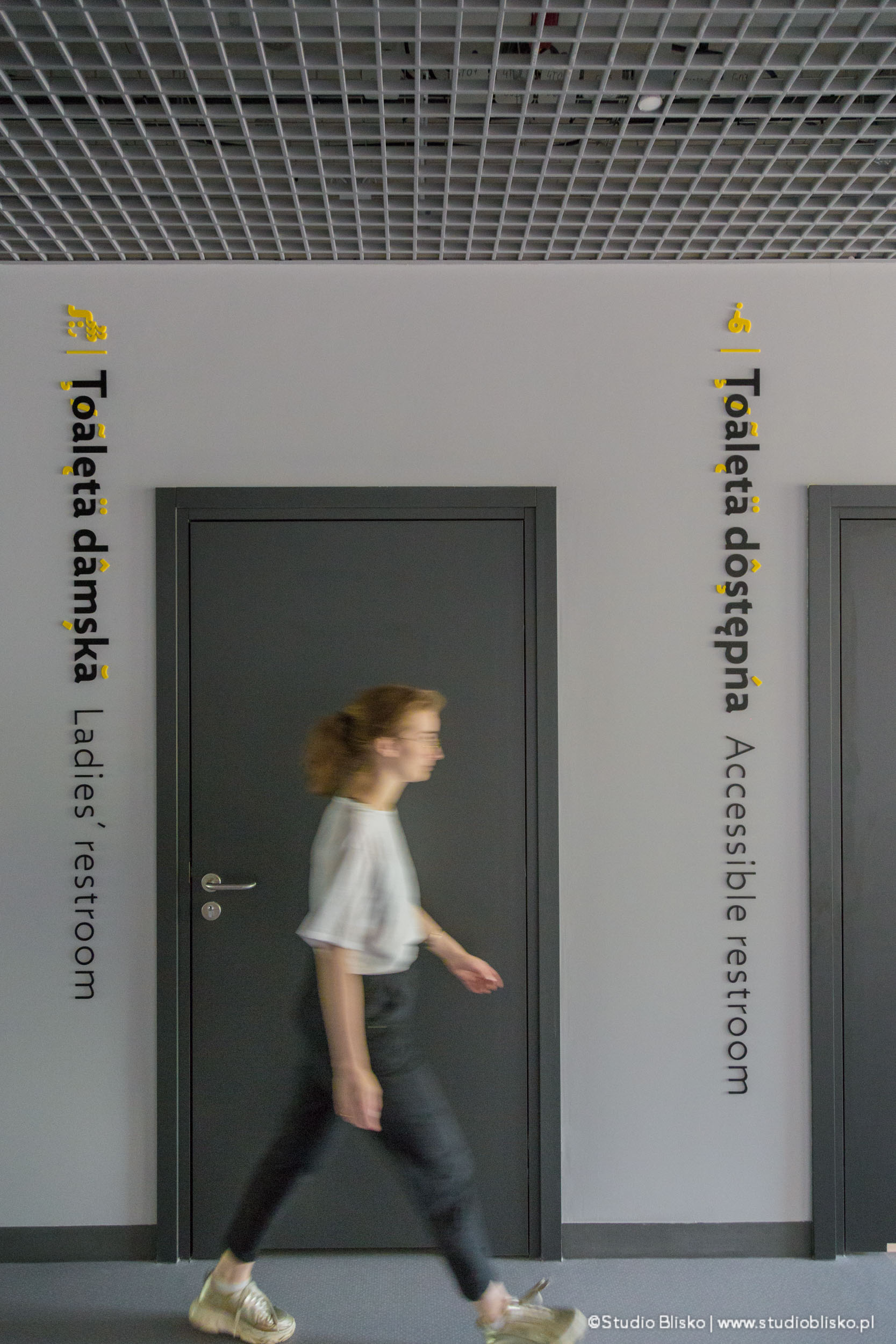
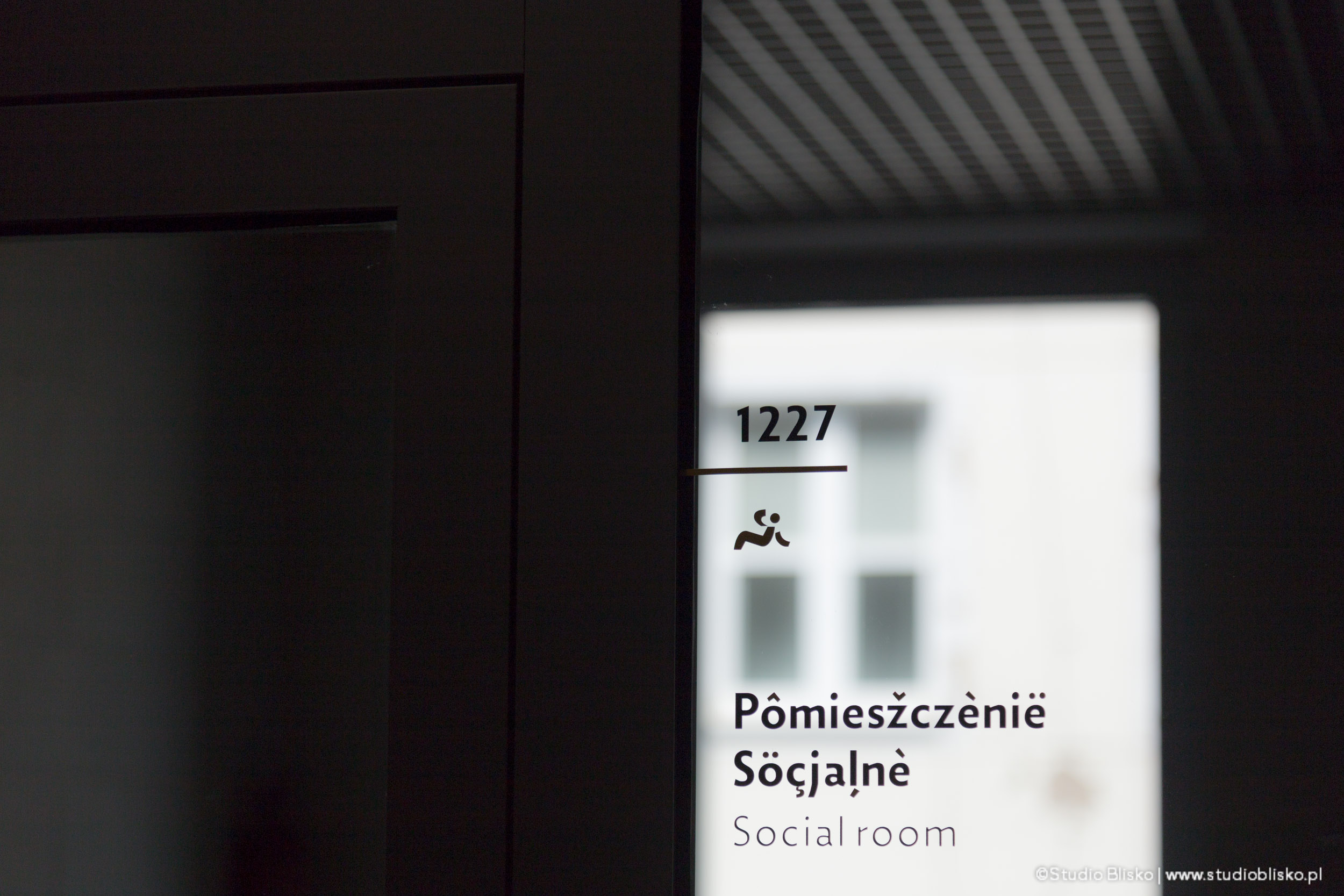
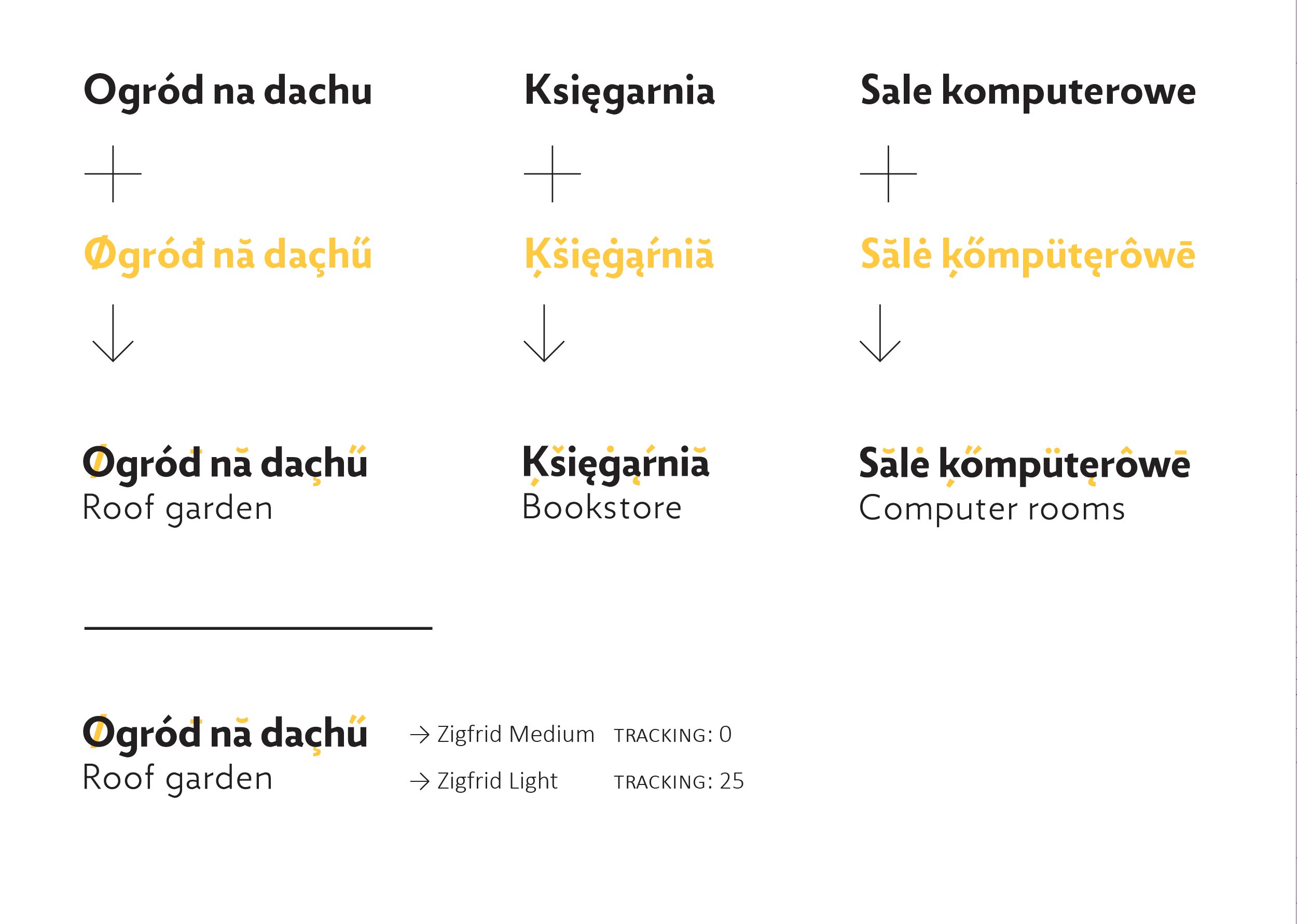
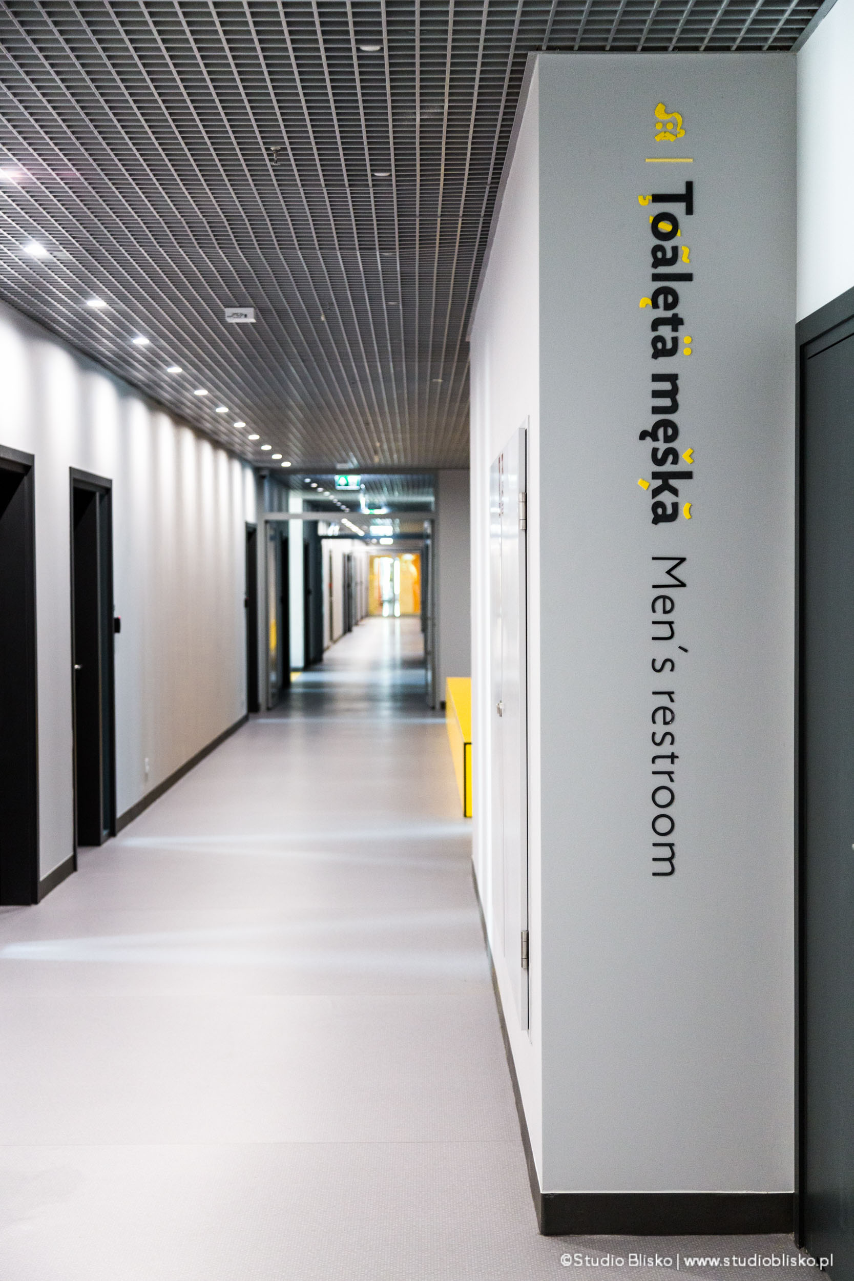
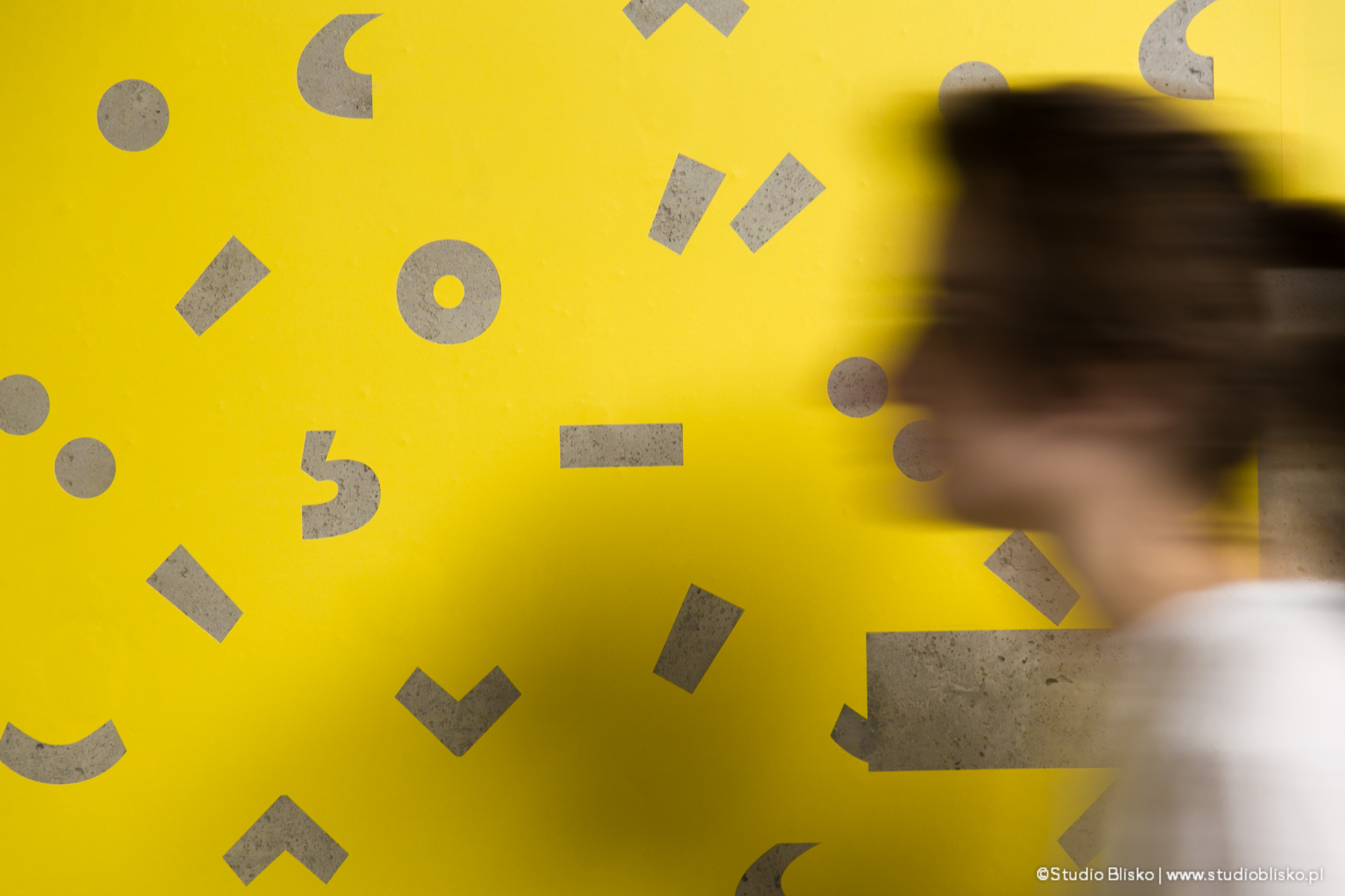
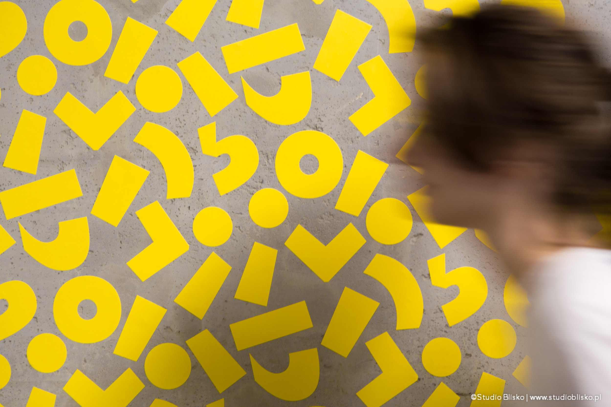
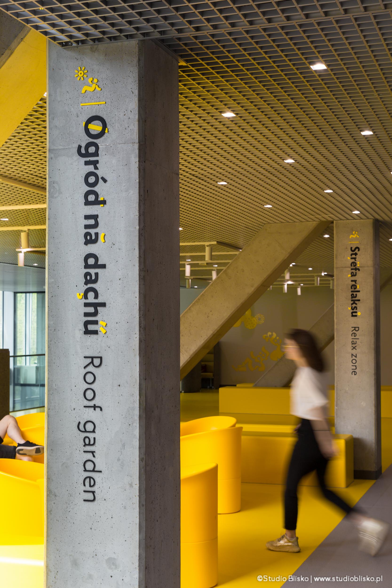
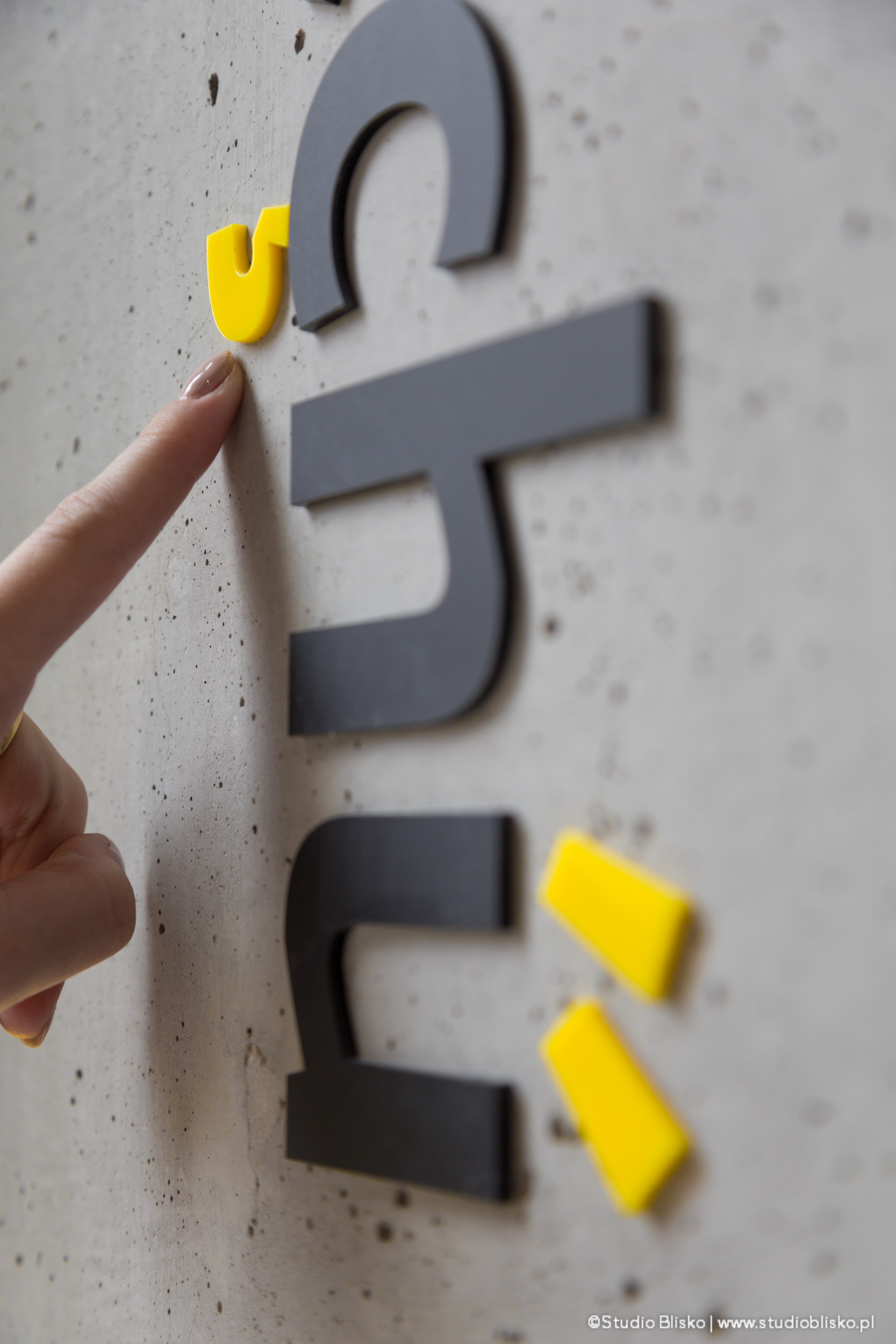
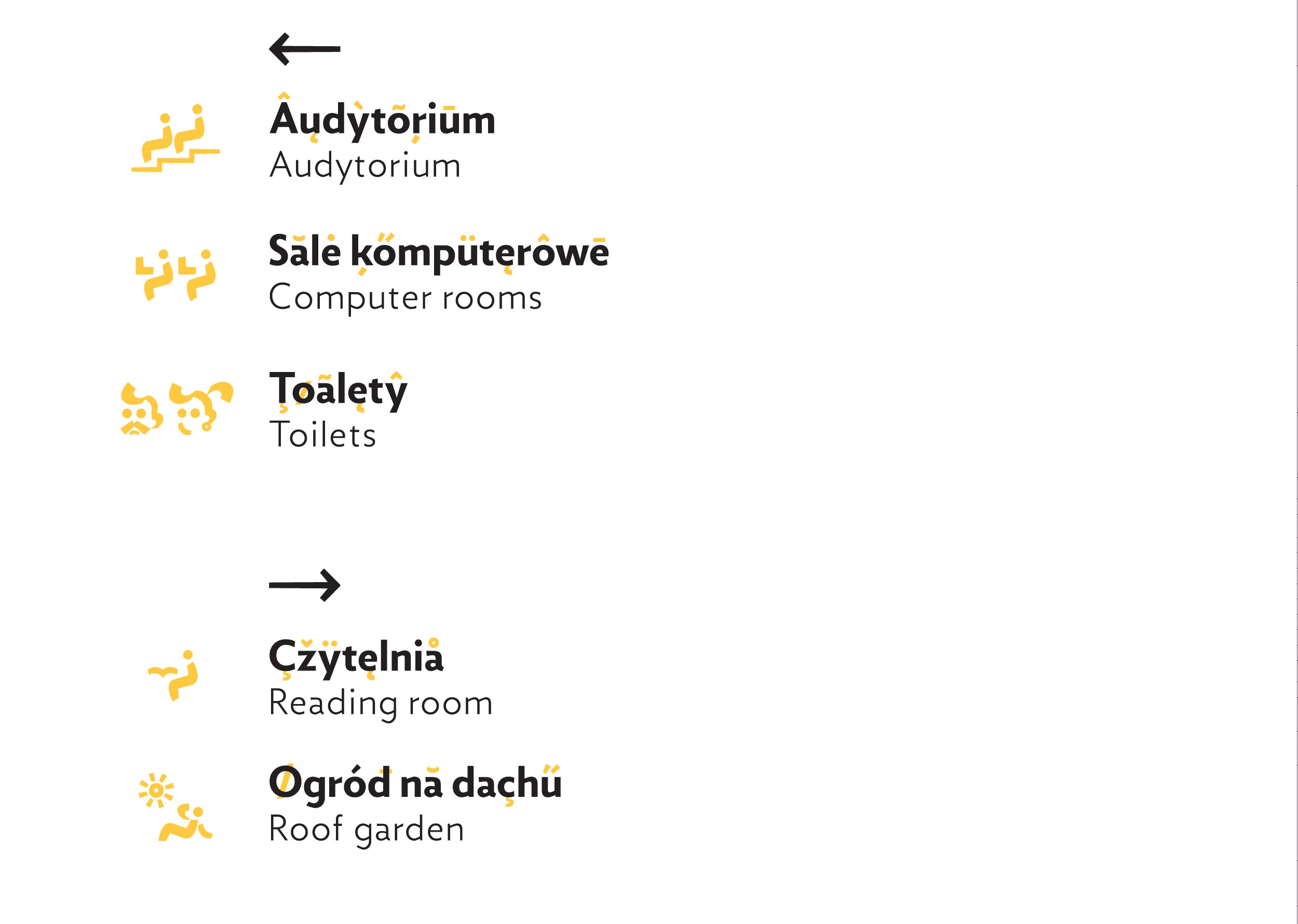
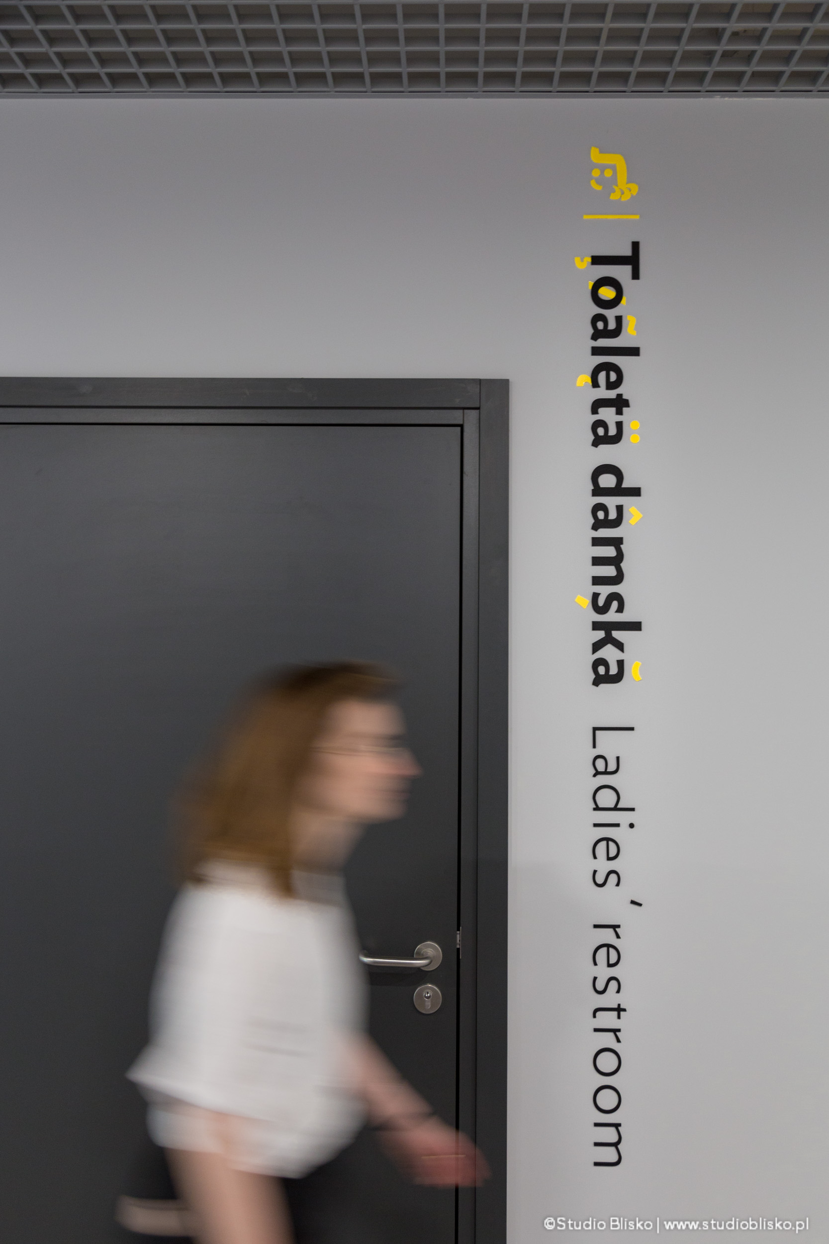
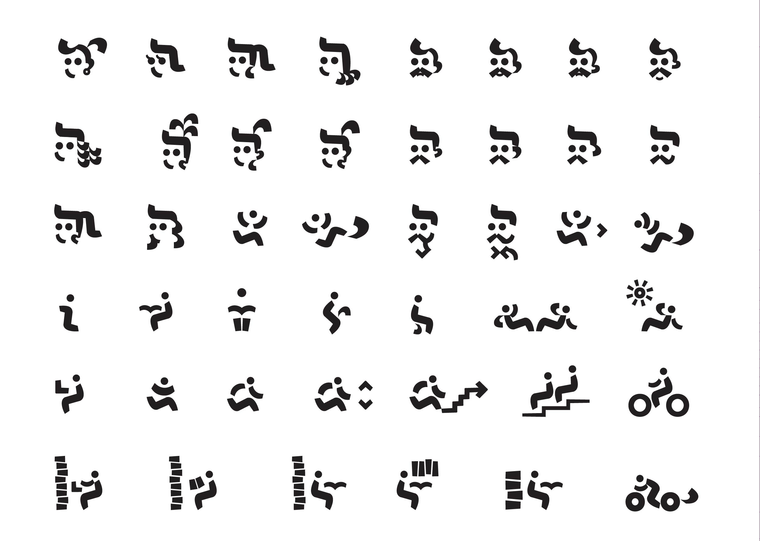
We treated the signage of the building, whose main goal is to teach communication, as an unusual opportunity for the creative use of typography. We interpreted communication as language communication and various languages as their representation in writing. They can be distinguished from each other through alphabets, and distinguishing languages from a given group, e.g., Latin languages, is possible, among others, through diacritical marks, characteristic of a particular language, such as ą and ę for the Polish language or ä, ö, ü found in the German language. Above these letters, there are diacritical marks, which we extracted as a graphic motif that builds and connects the entire visual information system.
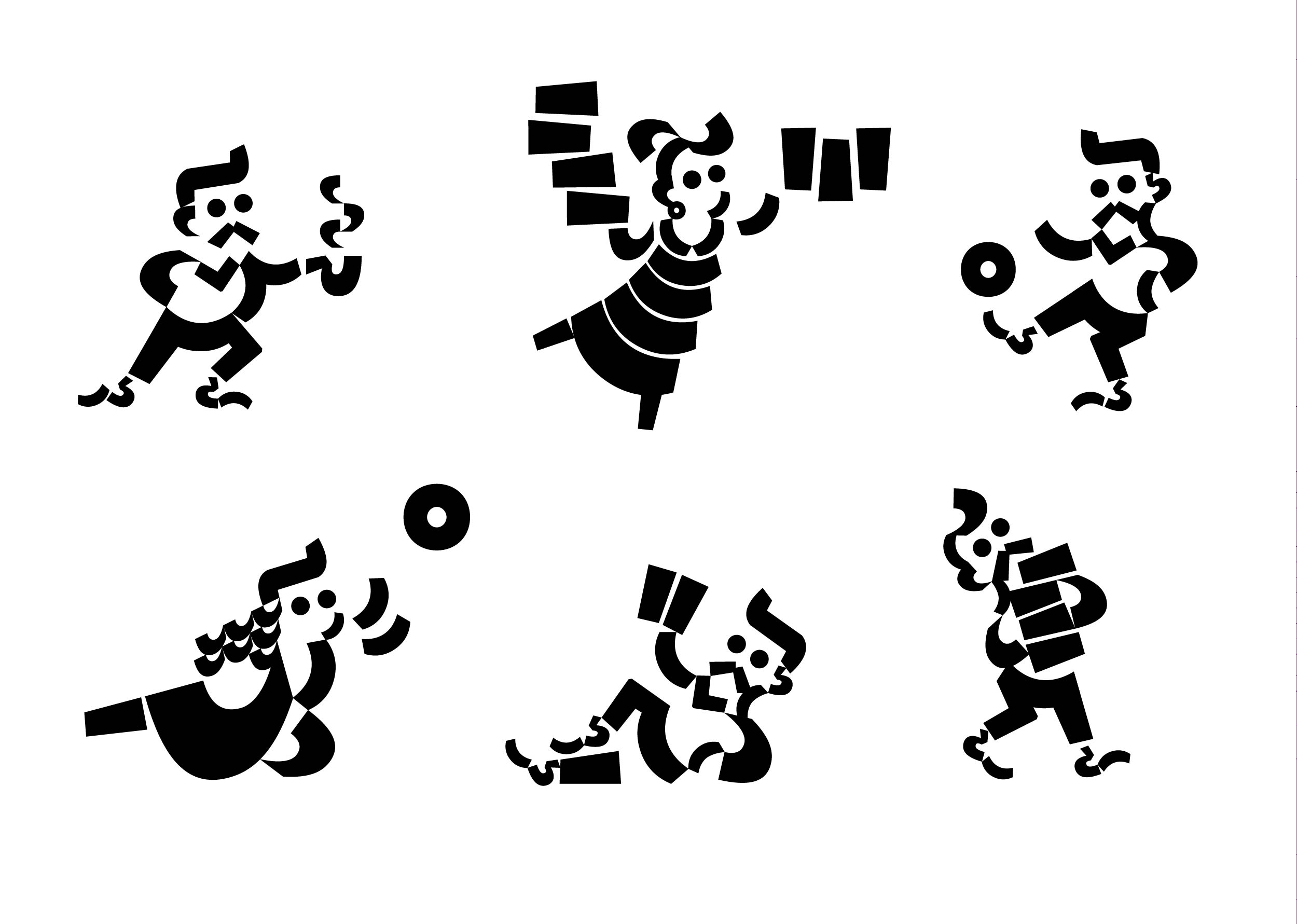
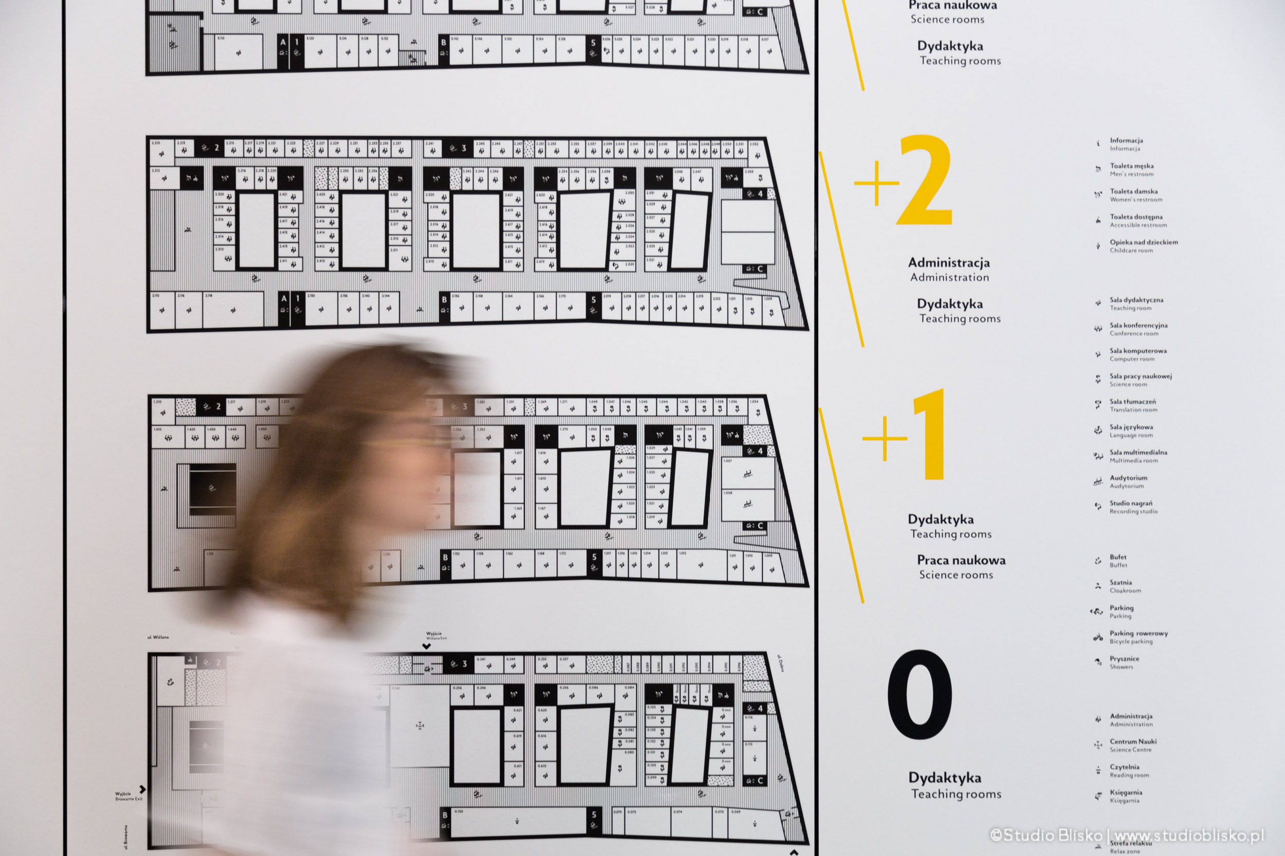
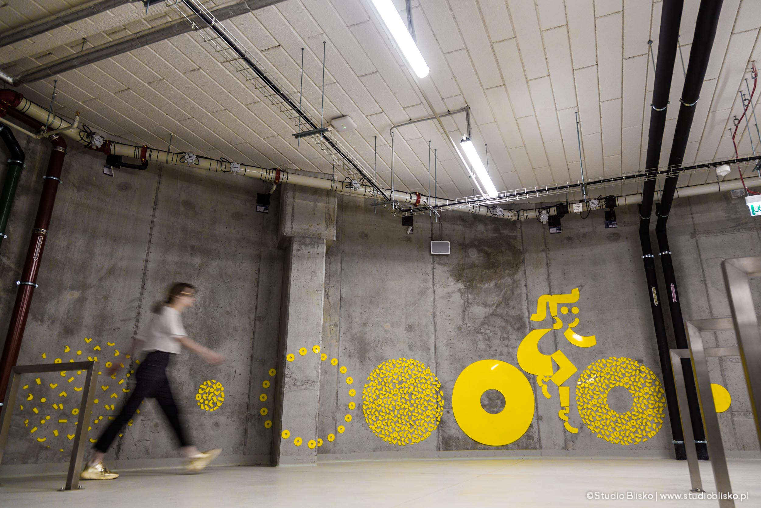
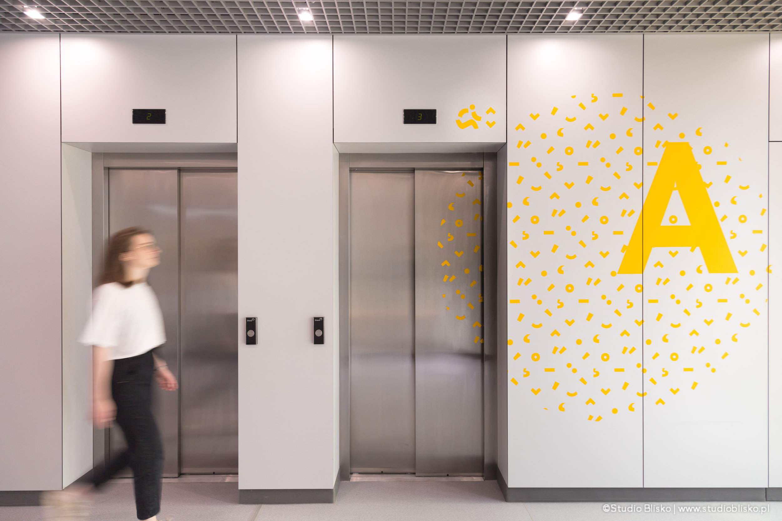
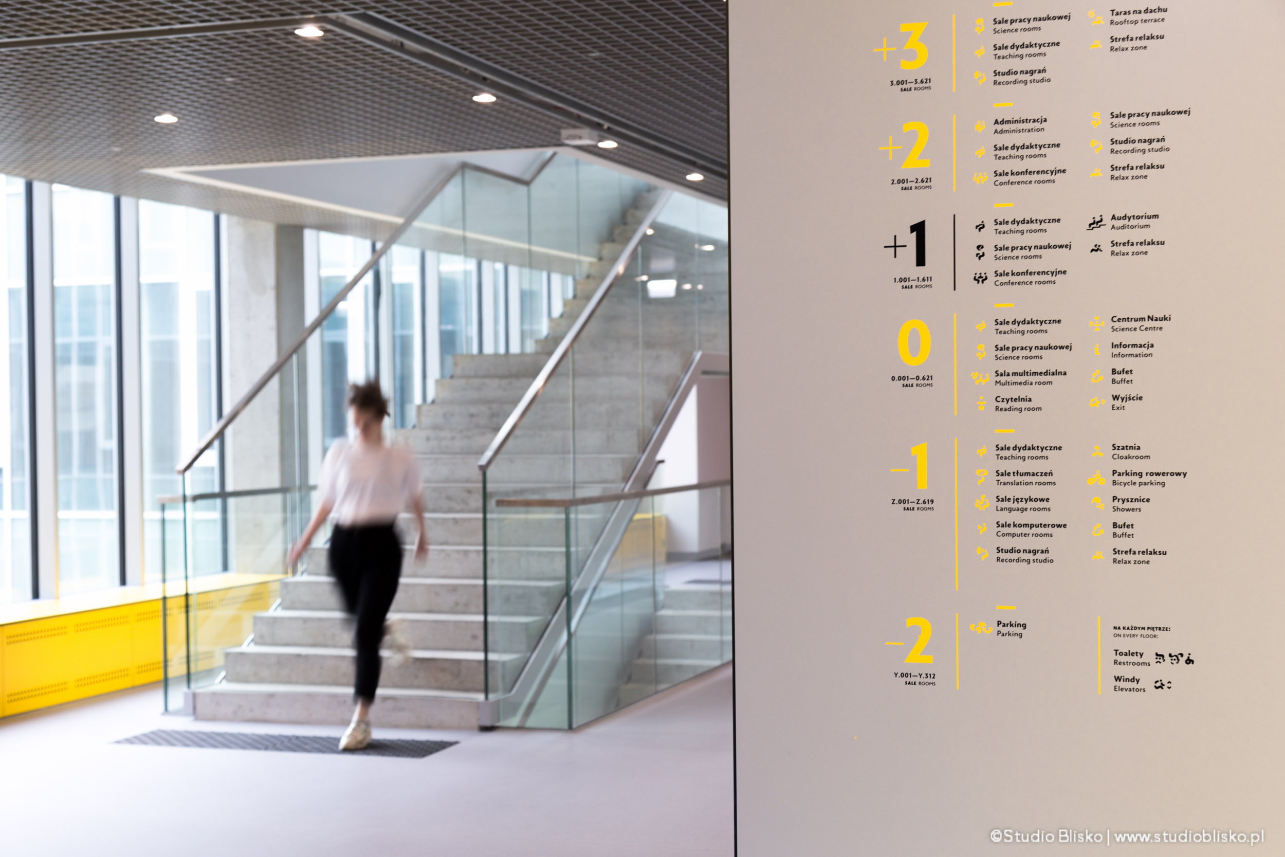
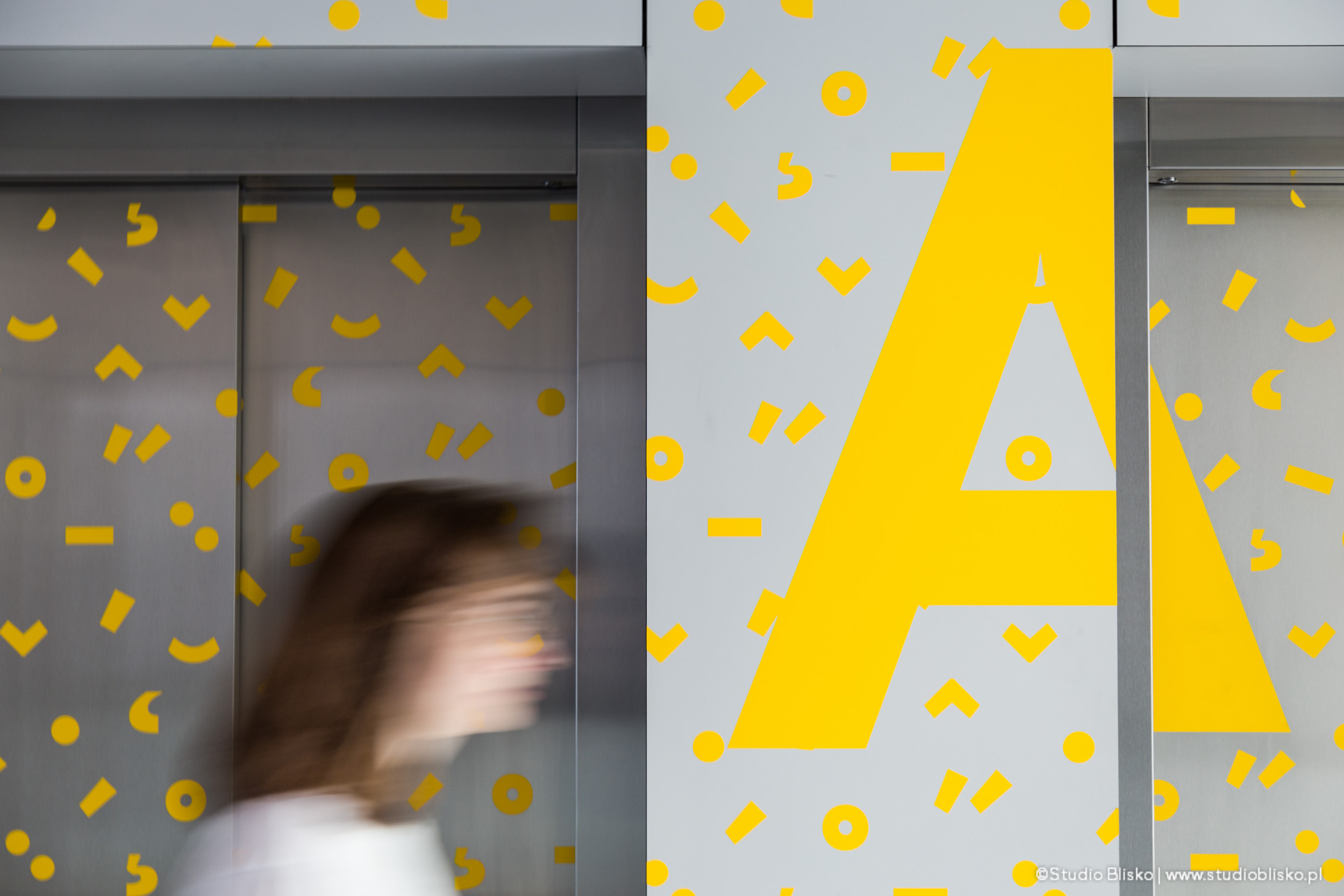
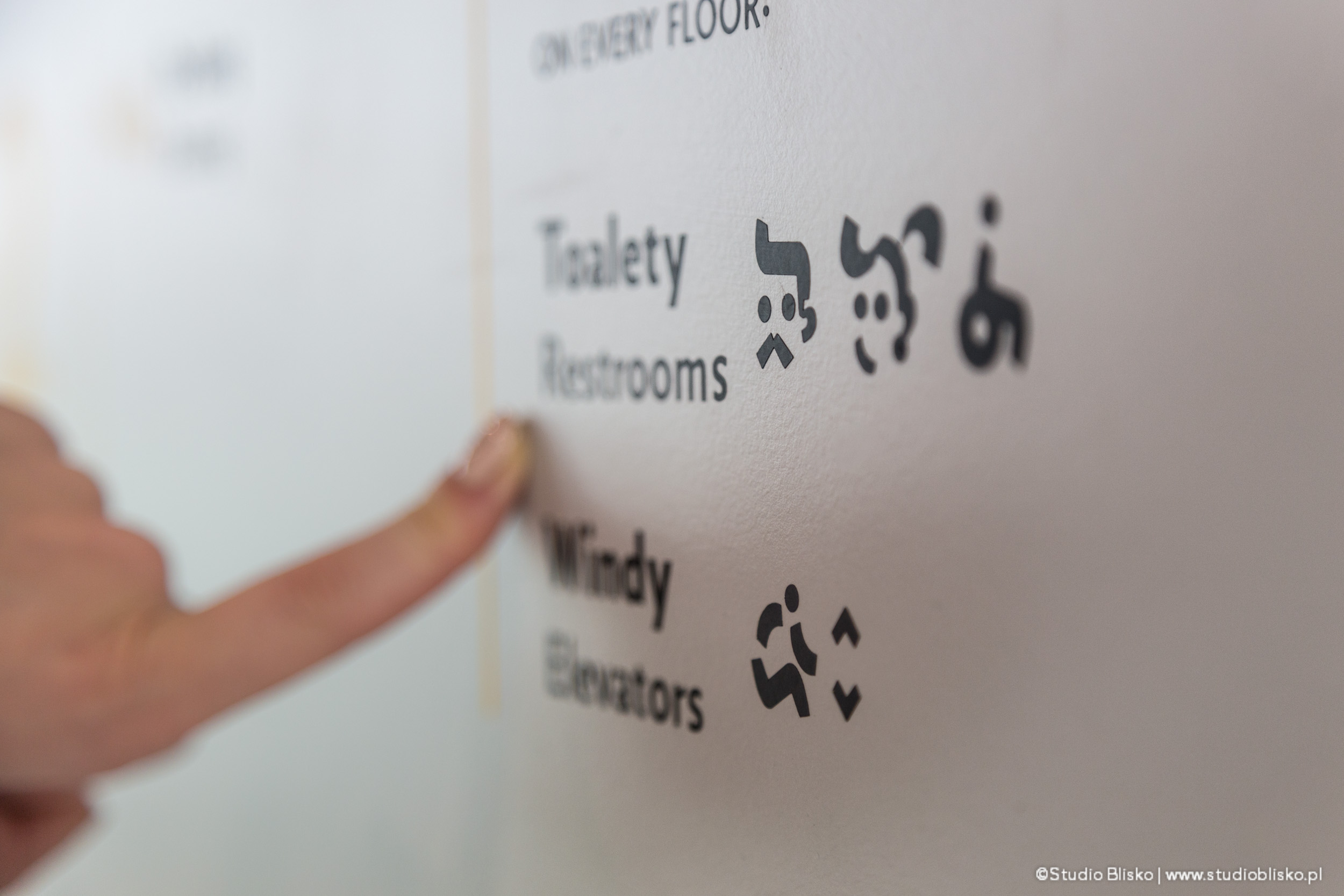
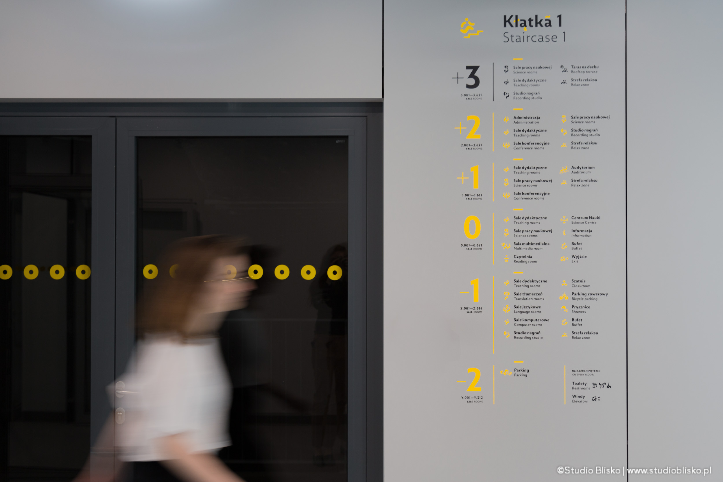
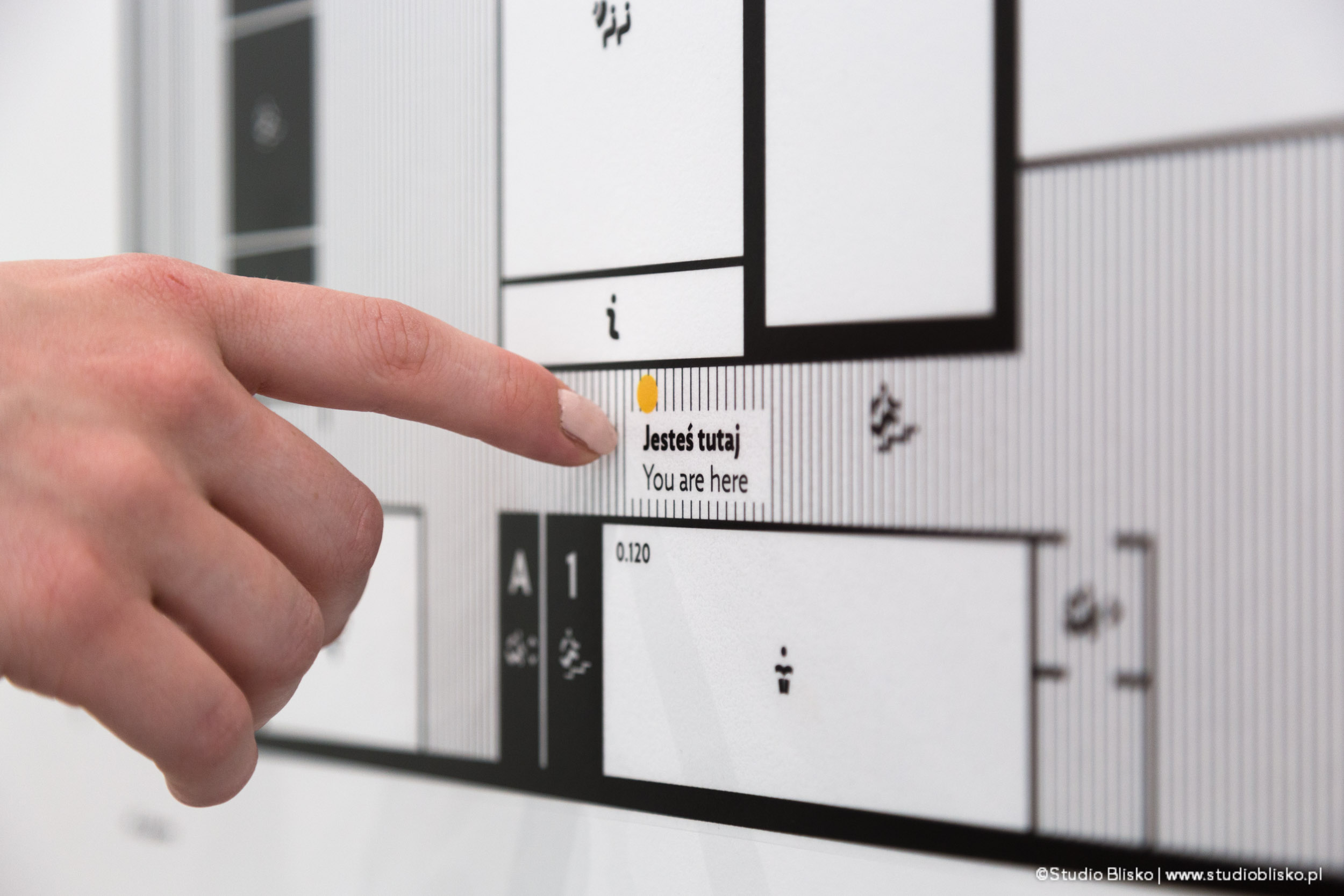
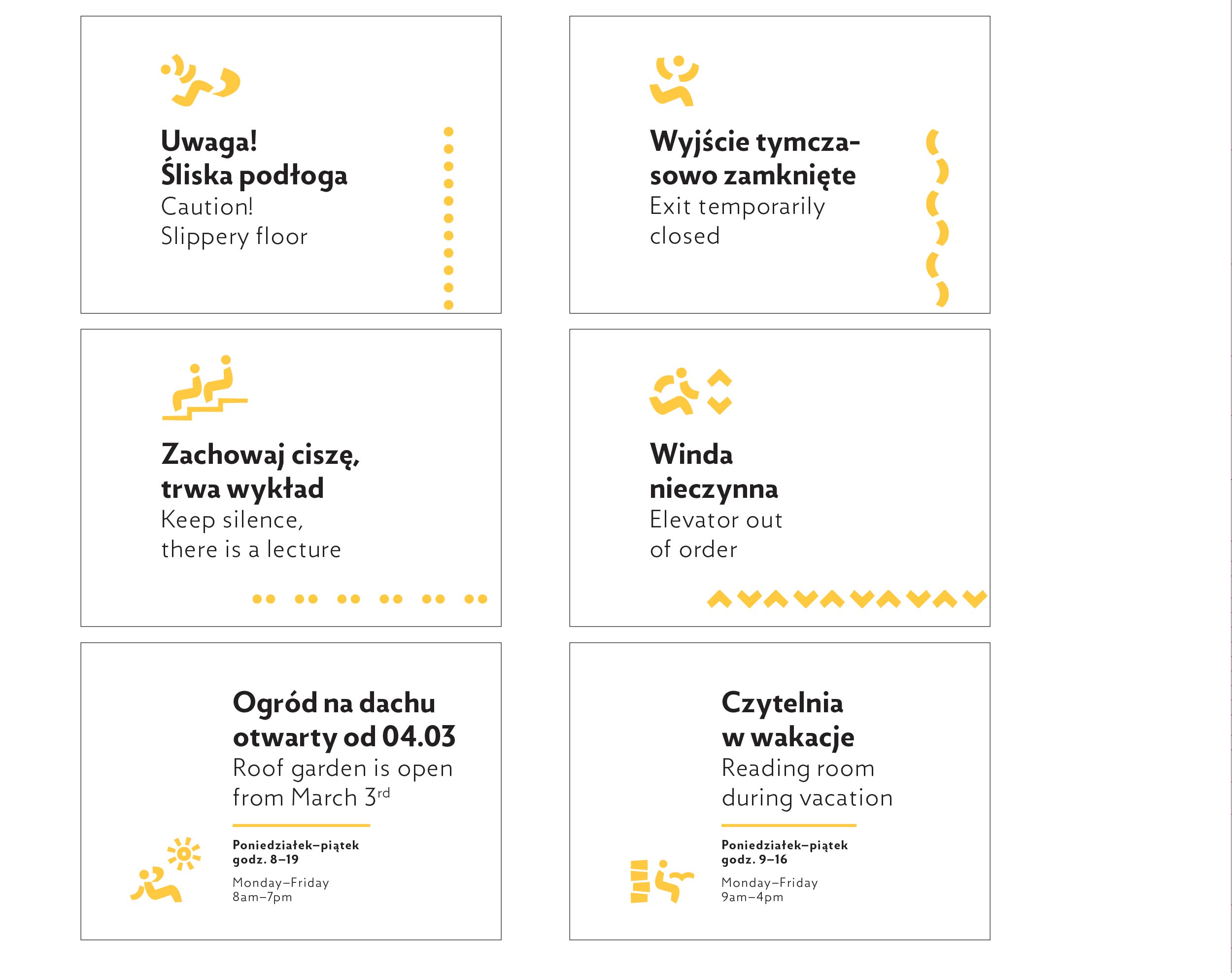
We created a closed catalog of graphic forms from the diacritics set, which we used in the project. We created a system of icons entirely from the above elements. We only allowed for their scaling, rotation, and duplication and did not apply any other modifications. These icons were then used to visualize all the functions of the building’s rooms, such as information, conference room, lecture hall, library, translation room, computer room, toilets, elevators, stairwells, bicycle storage, parking, and all others from the functional program. They appear alongside written information, supporting and facilitating information transfer.
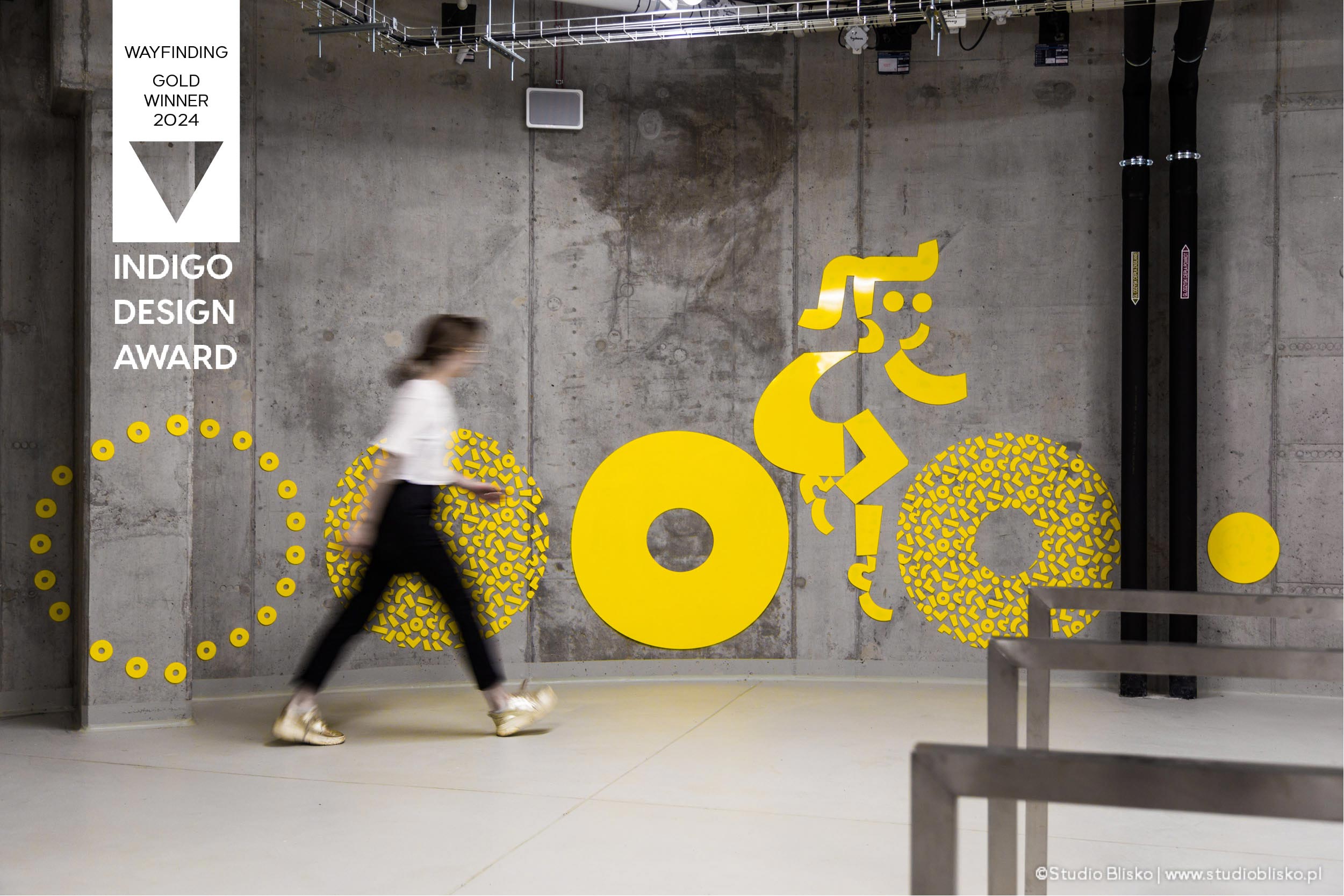
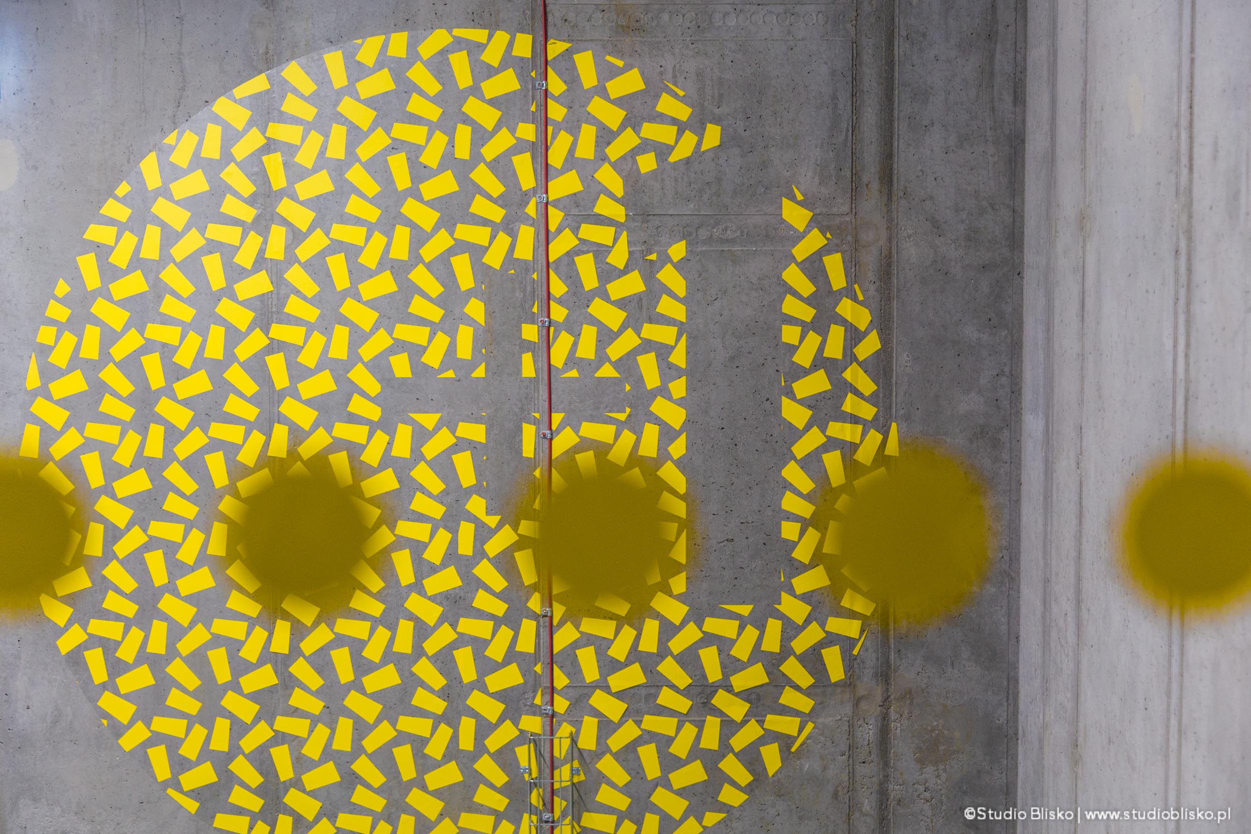
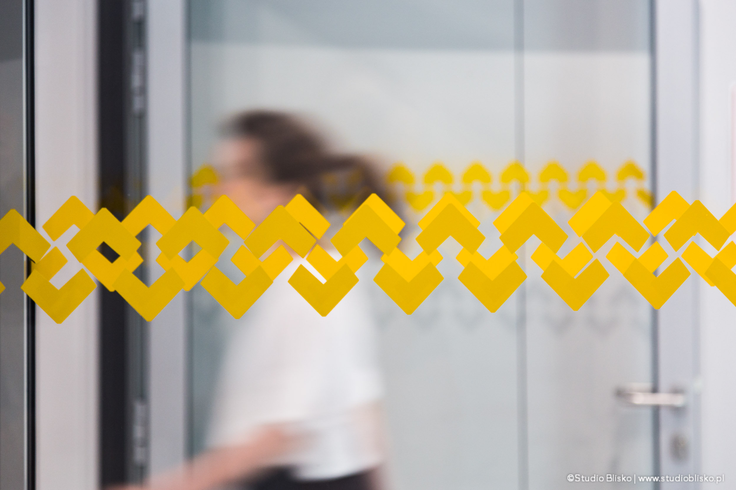
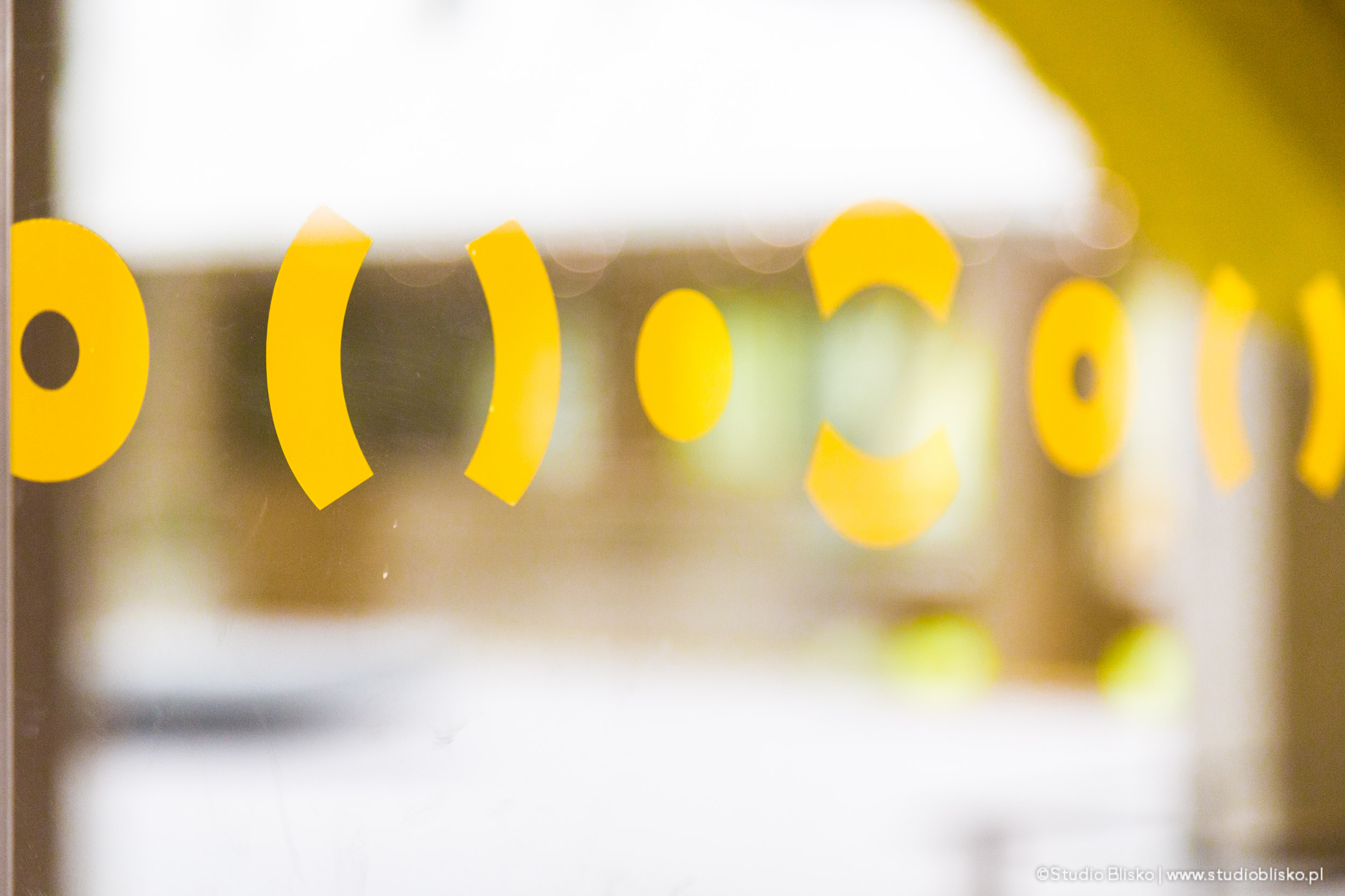
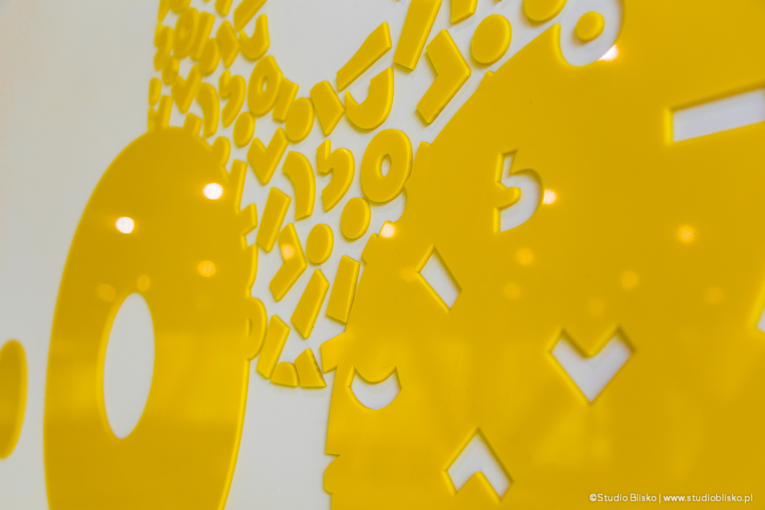
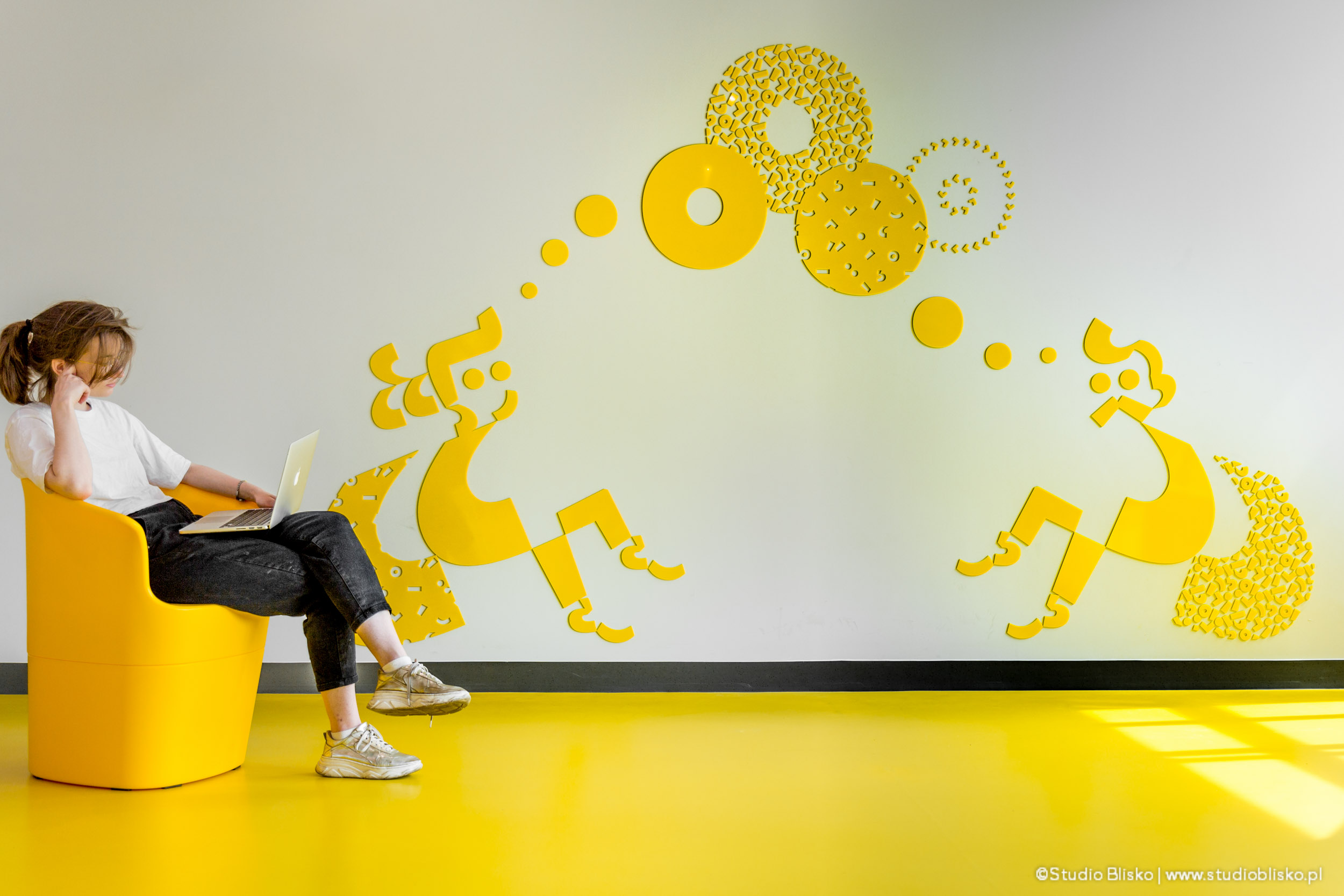
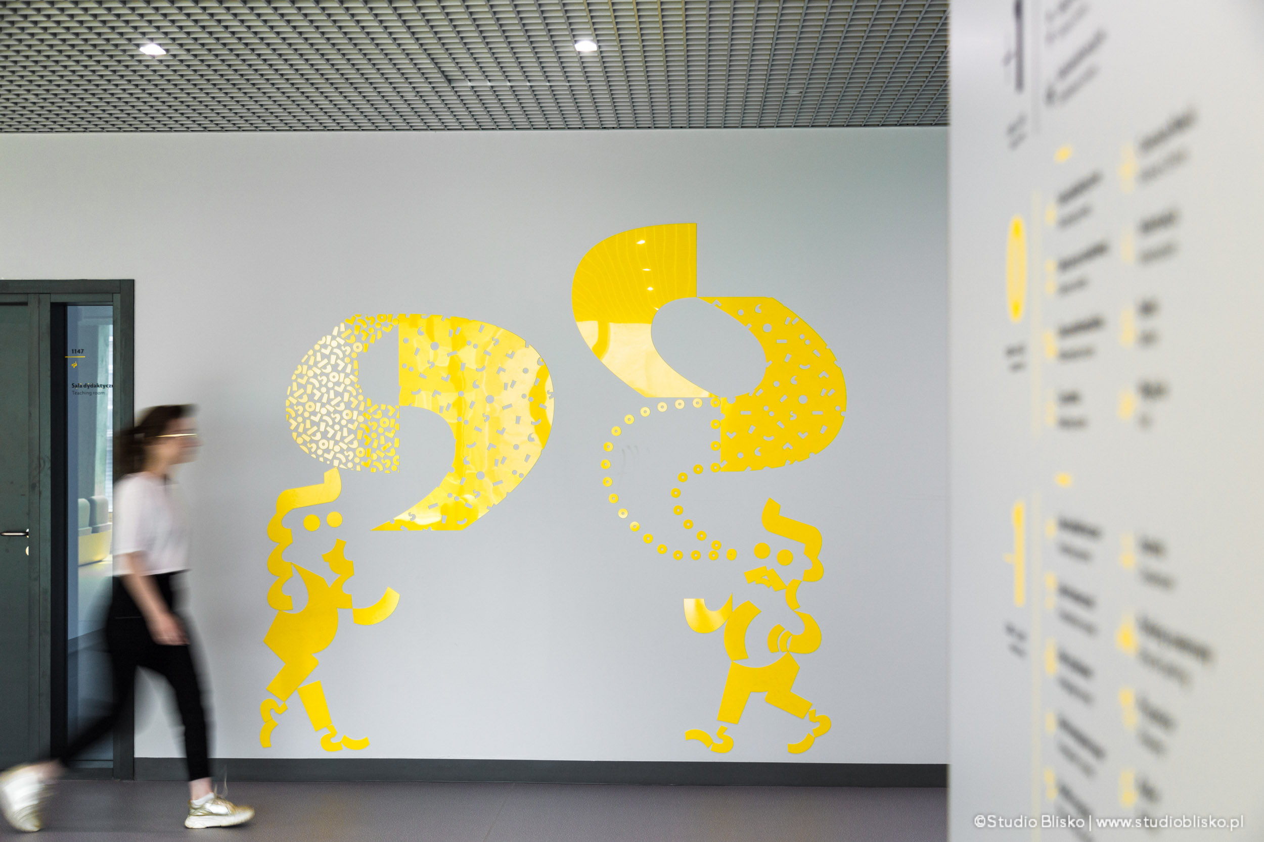
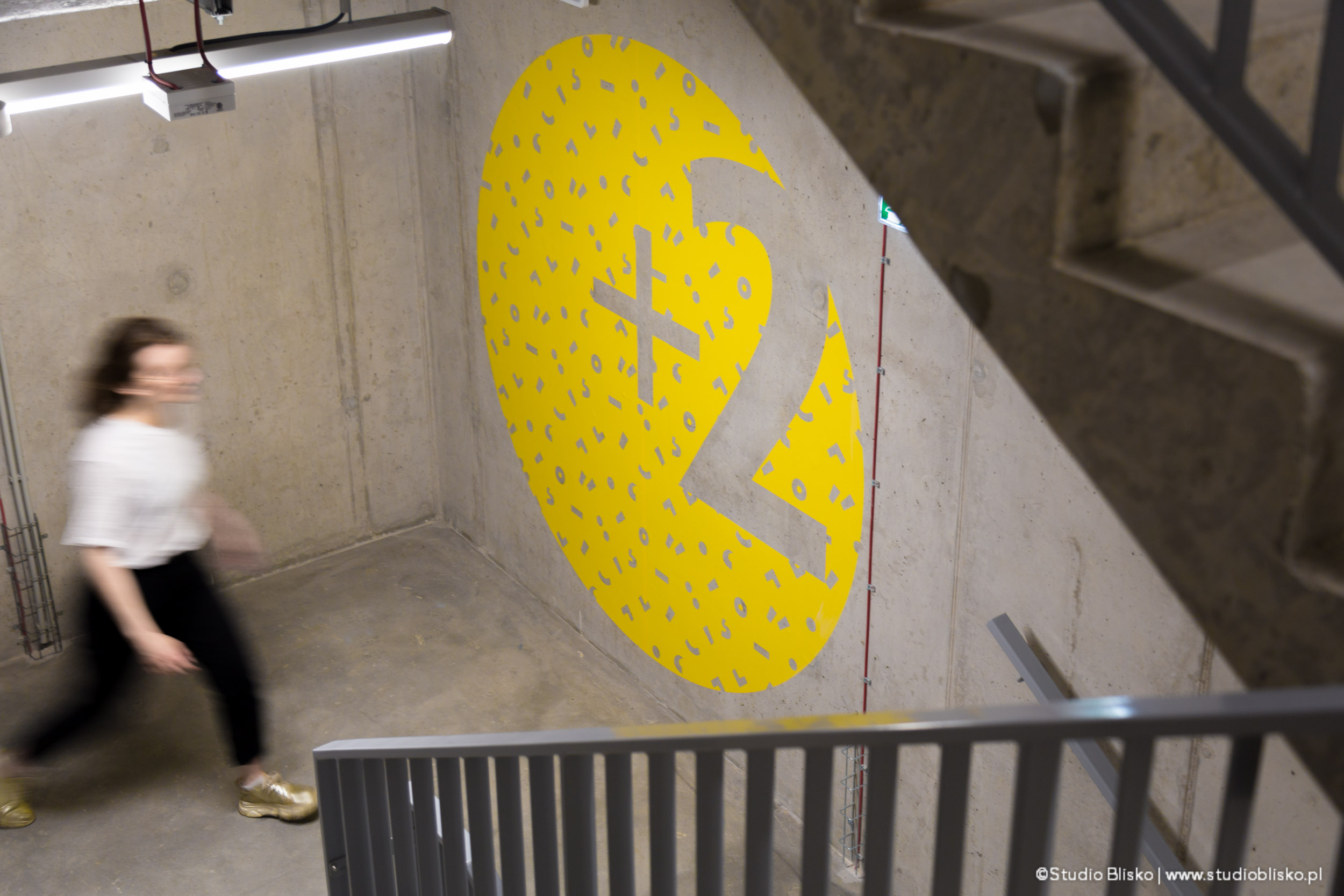
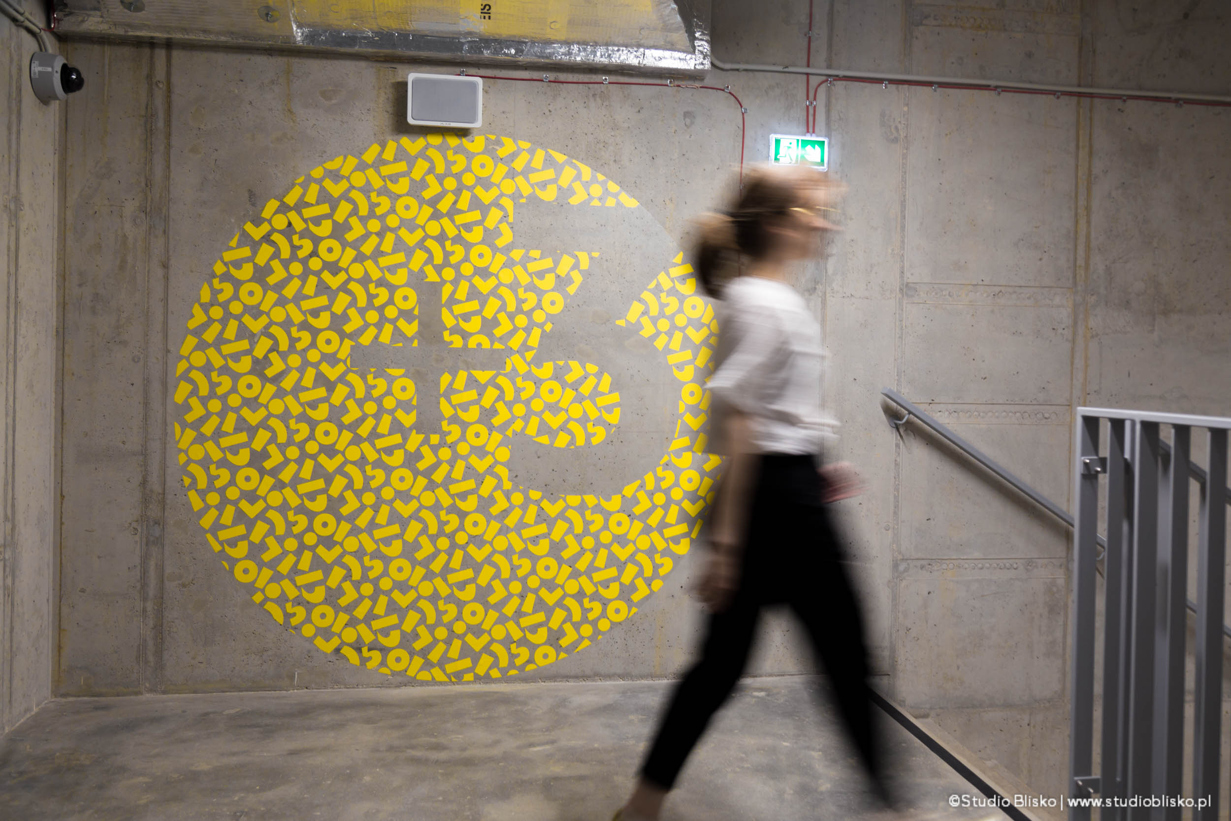
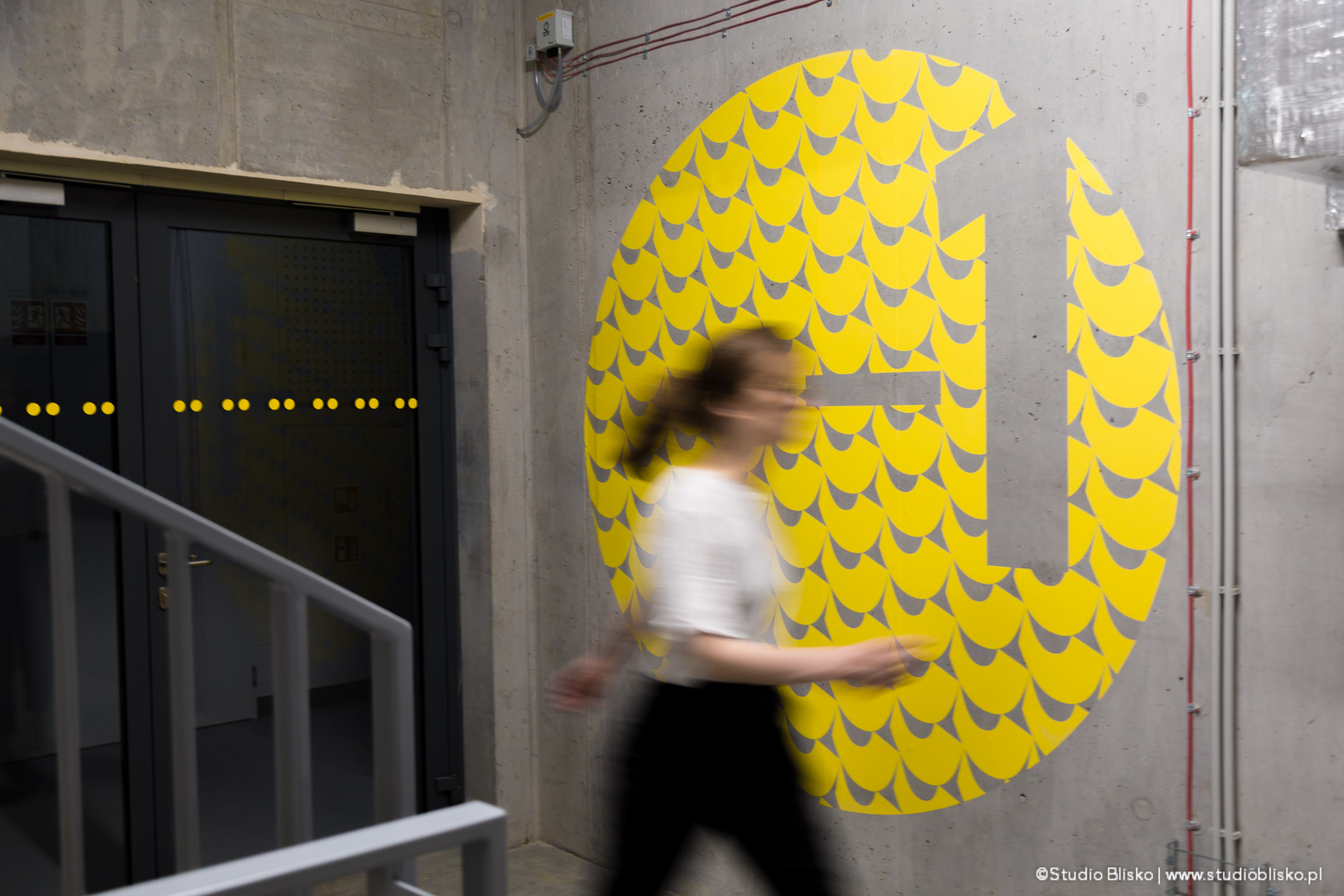
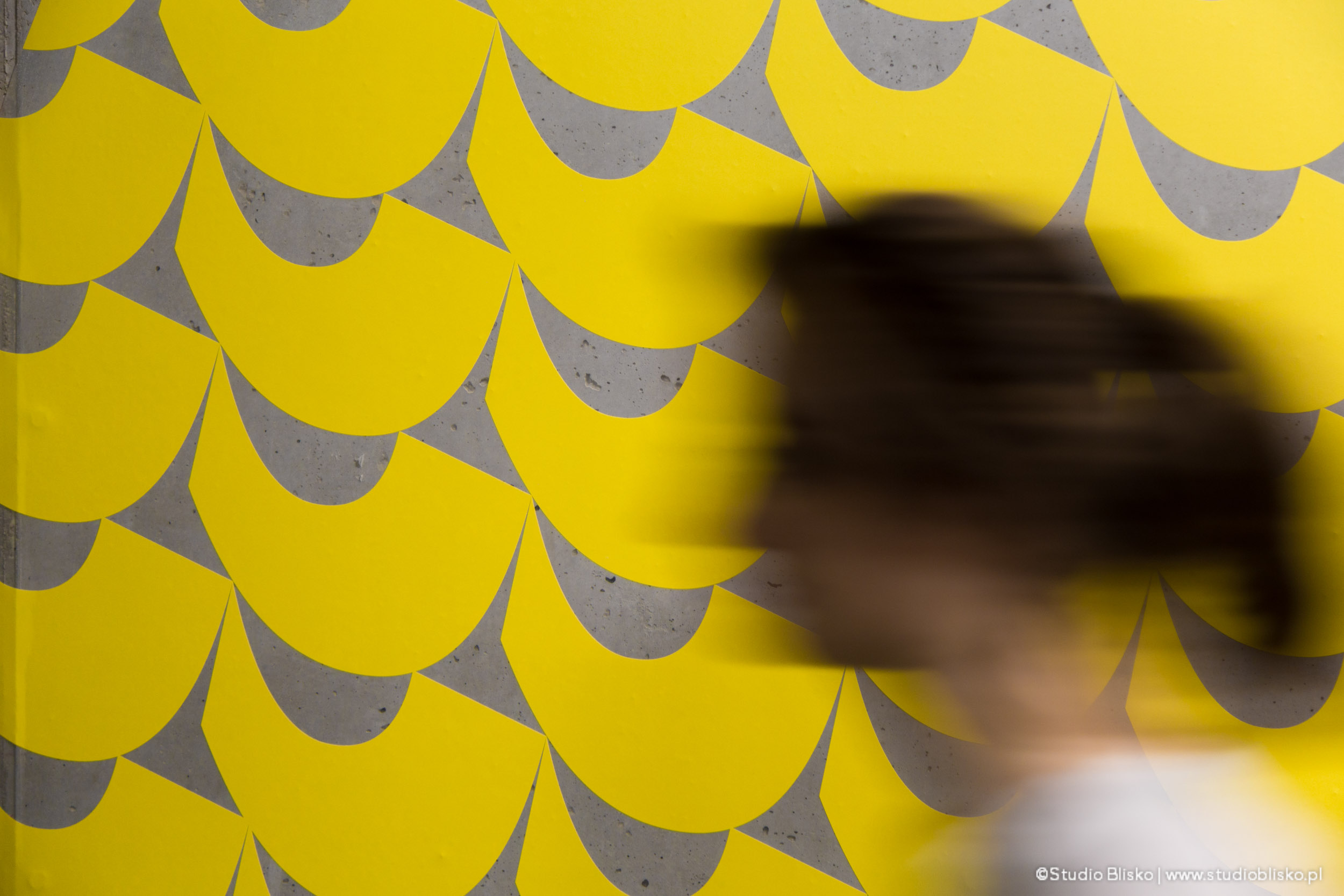
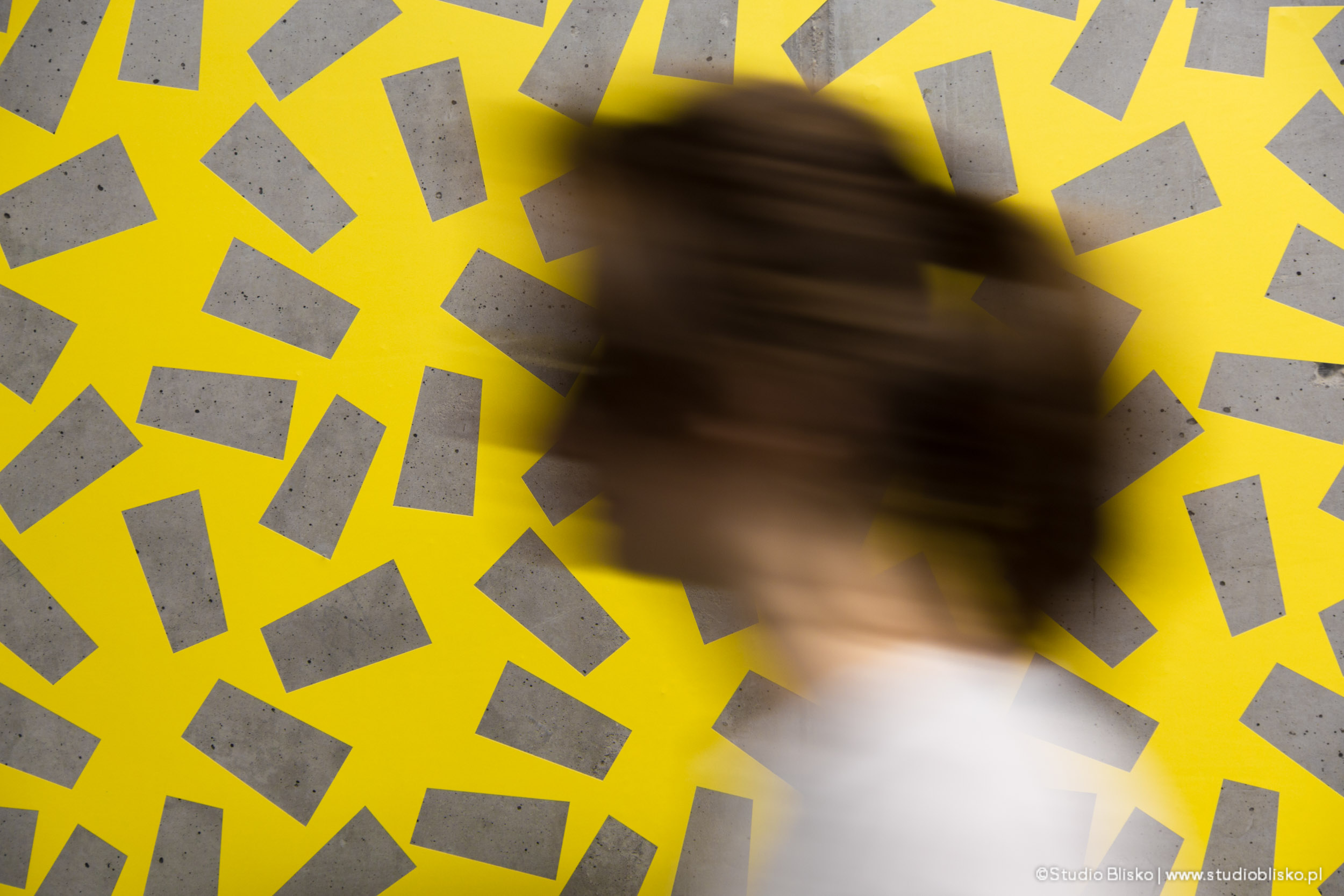
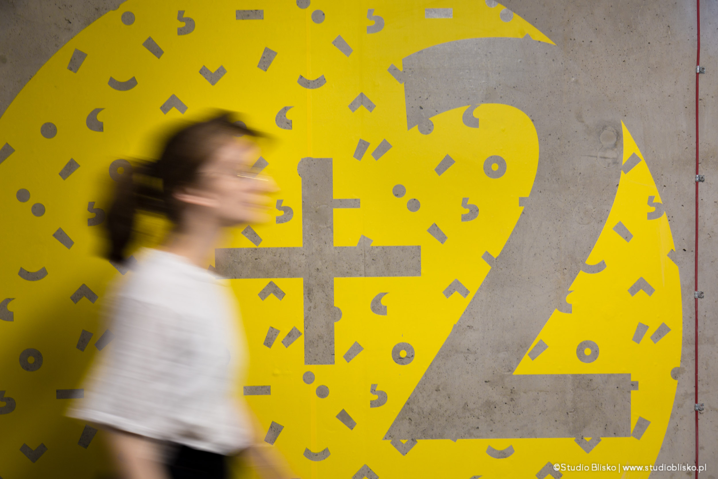
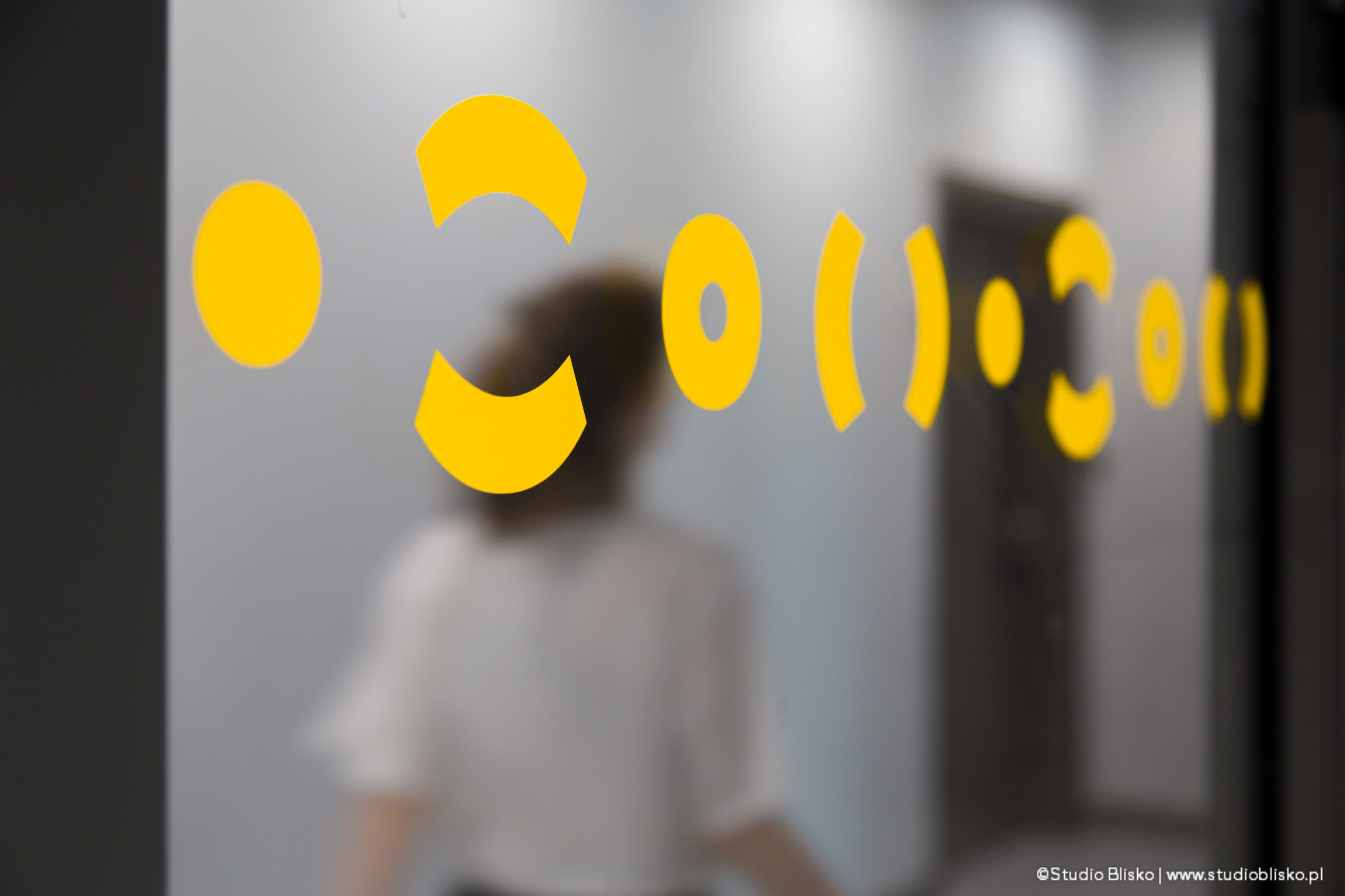
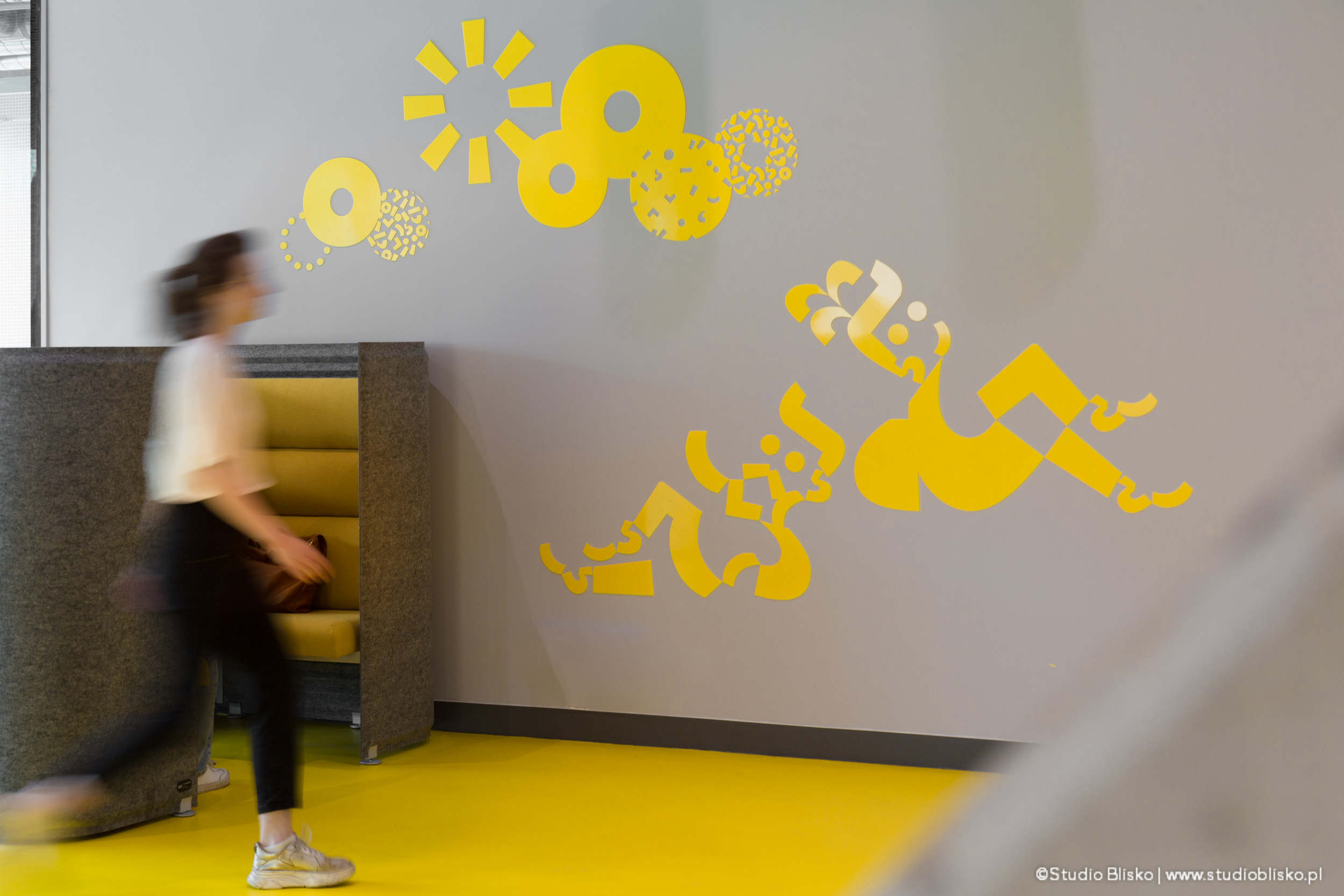
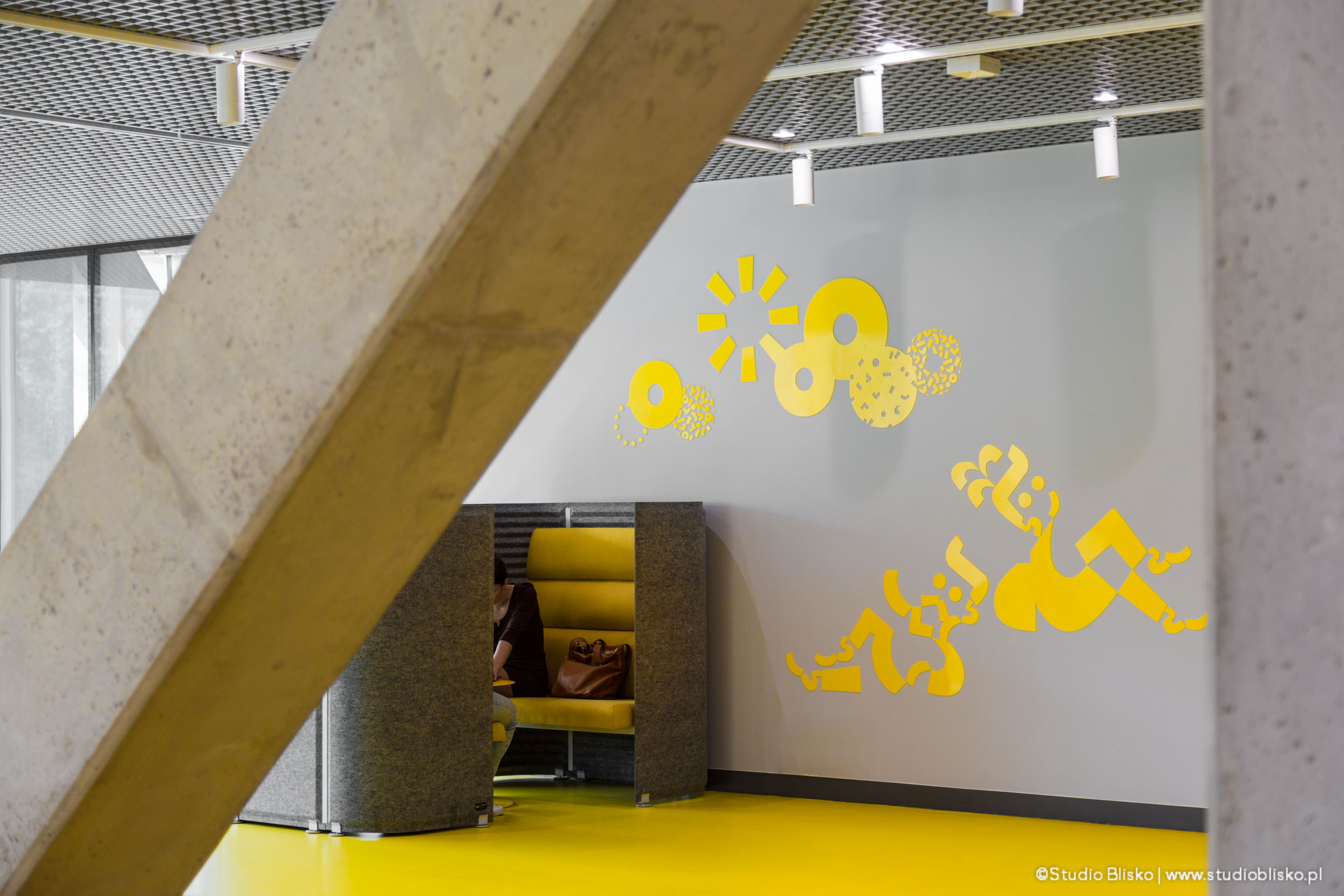
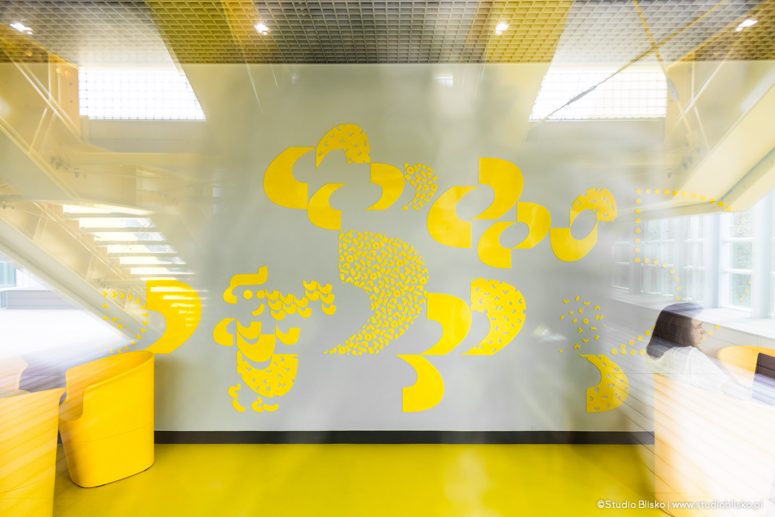
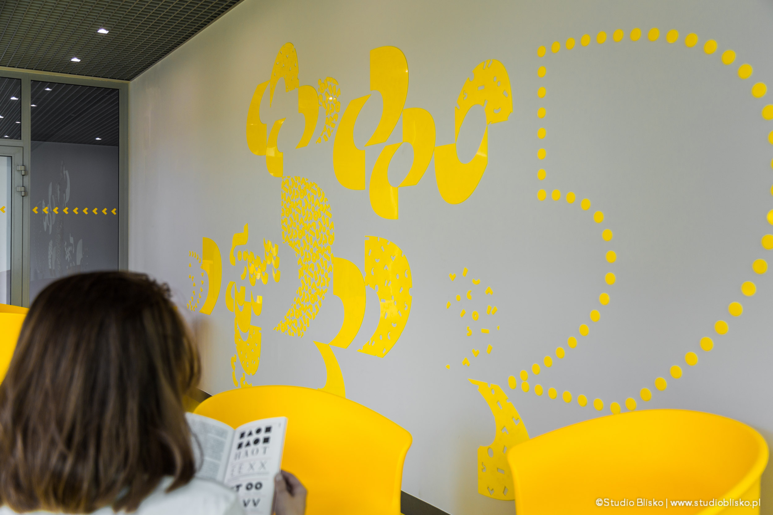
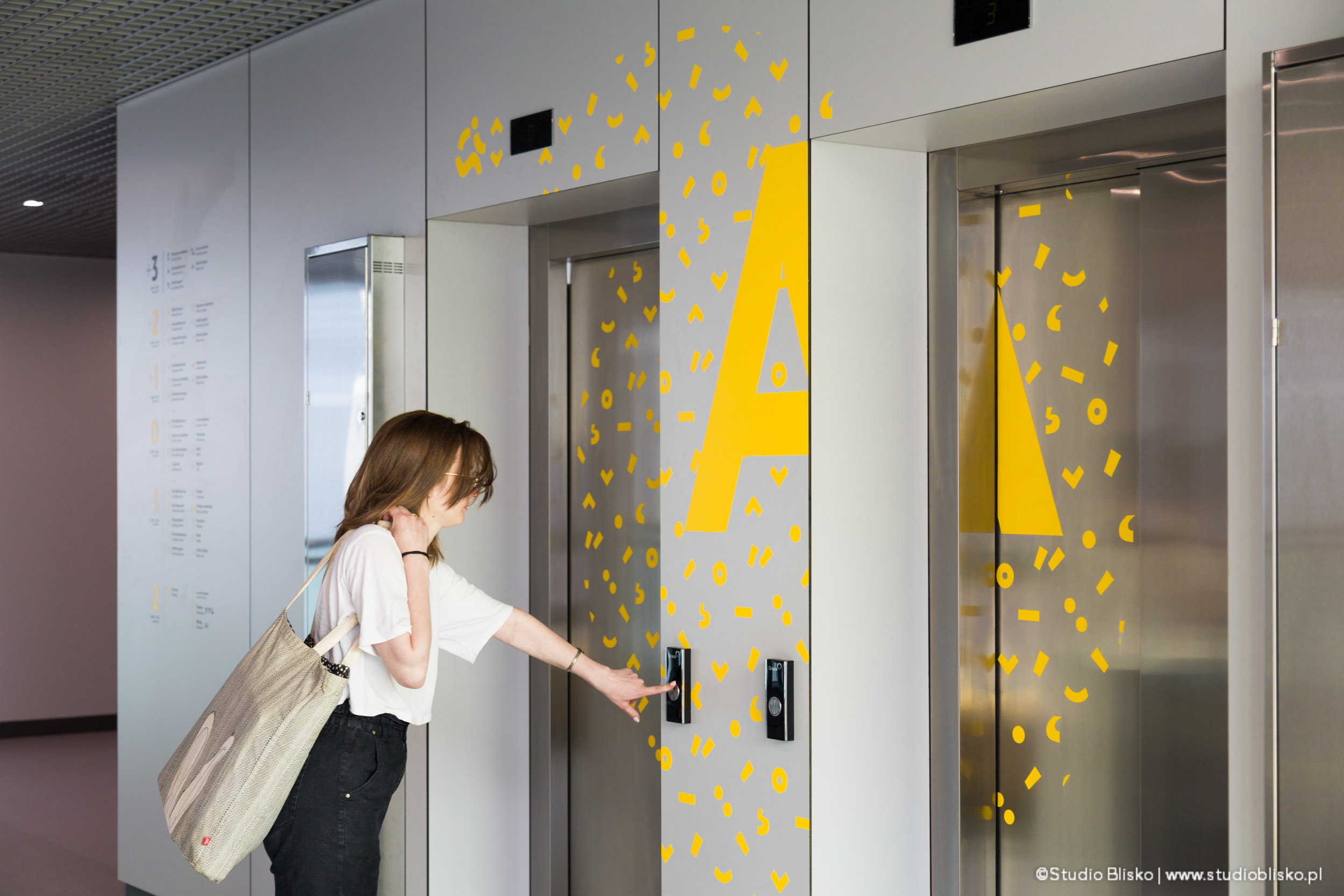
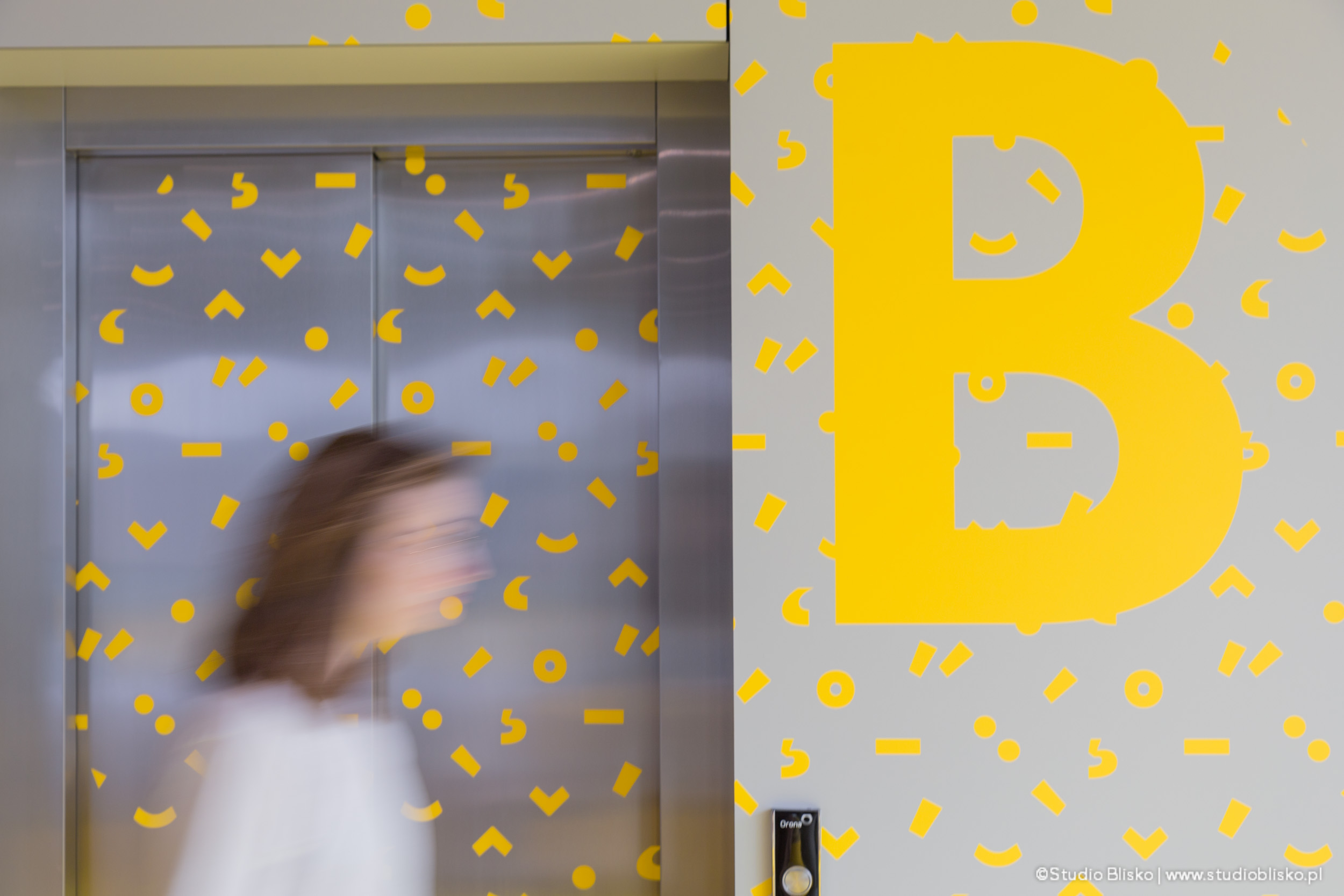
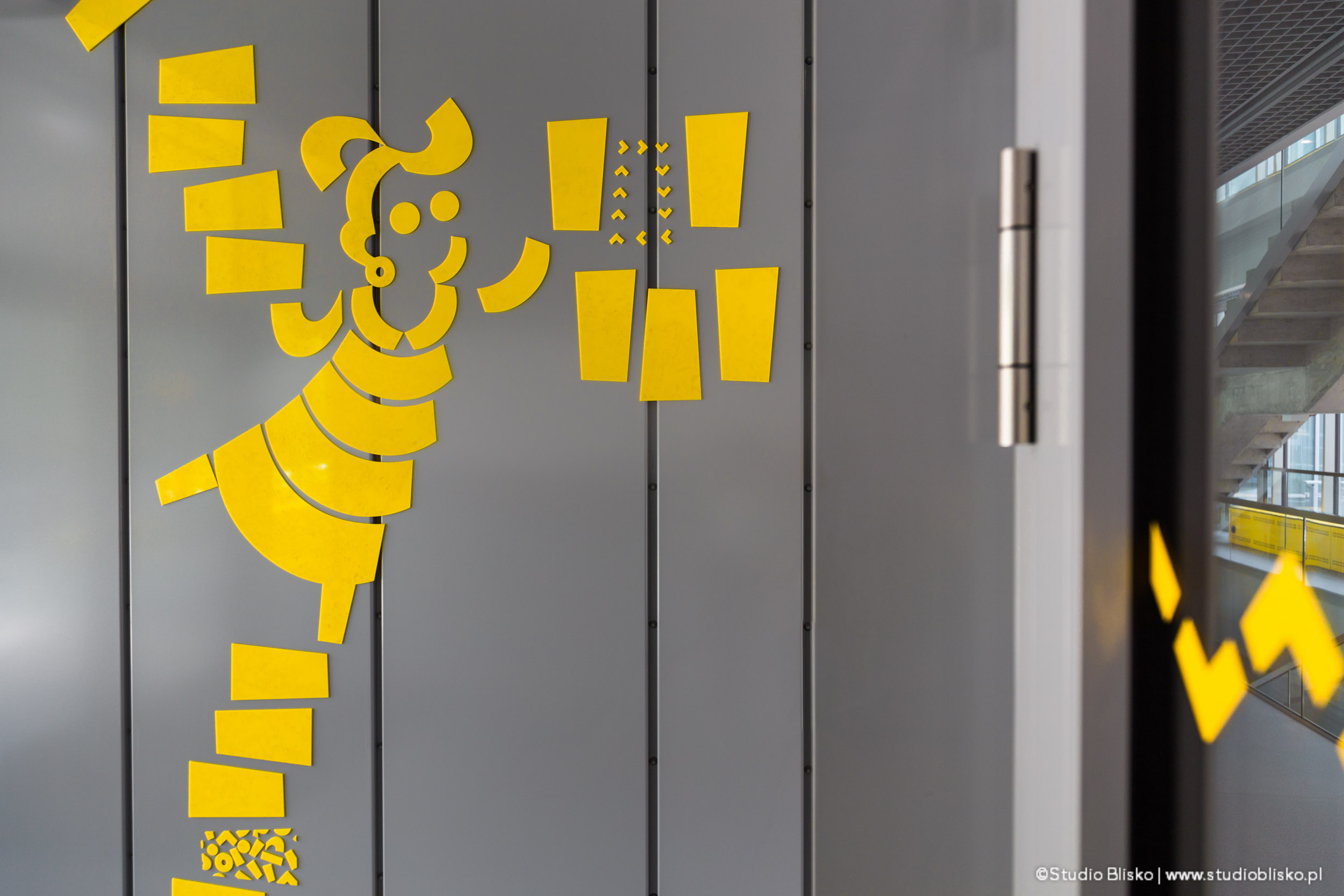
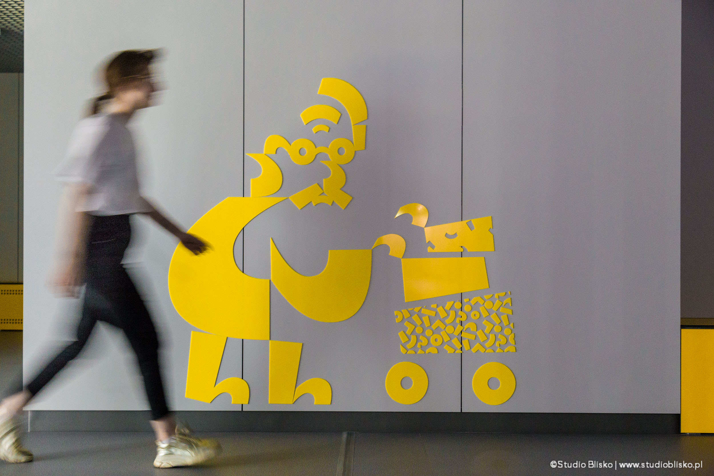
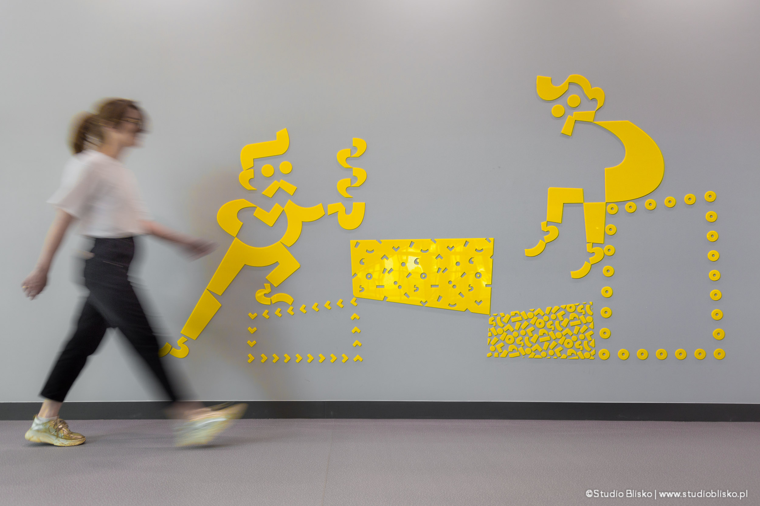
Diacritics have become the graphic theme and the foundation of the entire visual information system. They were used not only in the form of icons but also as decoration for important keywords/titles, i.e. typographic inscriptions in space. They were also used as graphic differentiation of individual building areas – in the form of six different patterns, which from a distance signaled the floor or function. The same diacritics were used in the graphics project for glass partitions, protecting against collisions with windows. Consistently across the entire building, only selected diacritics arranged horizontally were used in the labeling system. Finally, from the same diacritical marks, we developed an illustrative style, extending beyond iconography and depicting entire genre scenes from the life of the building and its functions. For example, a scene of students discussing with each other, a scene of browsing library collections, a scene of taking a break on the rooftop terrace, and a scene of buffet customers on the ground floor. They were placed in XXL-scale spaces and visualize the local functional context. They serve a dual purpose – firstly, informative with an informal narration and atmosphere suitable for the student space, and secondly, decorative in a space where, due to budget constraints typical of public investment, there was not a large budget for corridor finishes. Therefore, they took on the role of its aestheticization and in effect, its warming and the possibility of making it familiar to users.
After building the graphic base in the form of icons, illustrations, patterns, and linear graphic motifs, we began to create a visual information system for the entire building. This meant the necessity of establishing the necessary types of signs and their placement by analyzing the functional program and user communication schemes based on architectural documentation. Then their hierarchization. A bilingual labeling model was then adopted, using Polish as the leading language and English as an additional one. The next step was to establish rules for using typography depending on the functional zone and the type of place in this large building, as well as the role of the sign, and then to determine the rules for its size, varieties, placement height, orientation in space, spacing, etc. We created modular solutions based on construction grids, which allow for consistency throughout the entire object, which is crucial in wayfinding, as it provides clarity and predictability in finding the way to the destination. It also allows for the adaptation of the labeling system in the future when some rooms in the building change their destination.
This is a wayfinding project for the signage of an educational object – the Faculty of Modern Languages building of the University of Warsaw at 55 Dobra Street in Warsaw. It is a part of the university campus and was created in two stages based on the winning concept by Kuryłowicz & Associates selected in the architectural competition in 2006. The project was then prepared for staging by the winners due to a lack of budget for the investment. The first stage, which constitutes a smaller part of the building located on Dobra Street, was completed in 2012. The remaining larger part was completed in 2019. The wayfinding system was developed and published in April/May 2022.
The building has received a prestigious ARCHITECTURAL PRIZE OF THE MAYOR OF WARSAW in the category of BEST PUBLIC SERVICE BUILDING 2021 (see the catalog: link).


